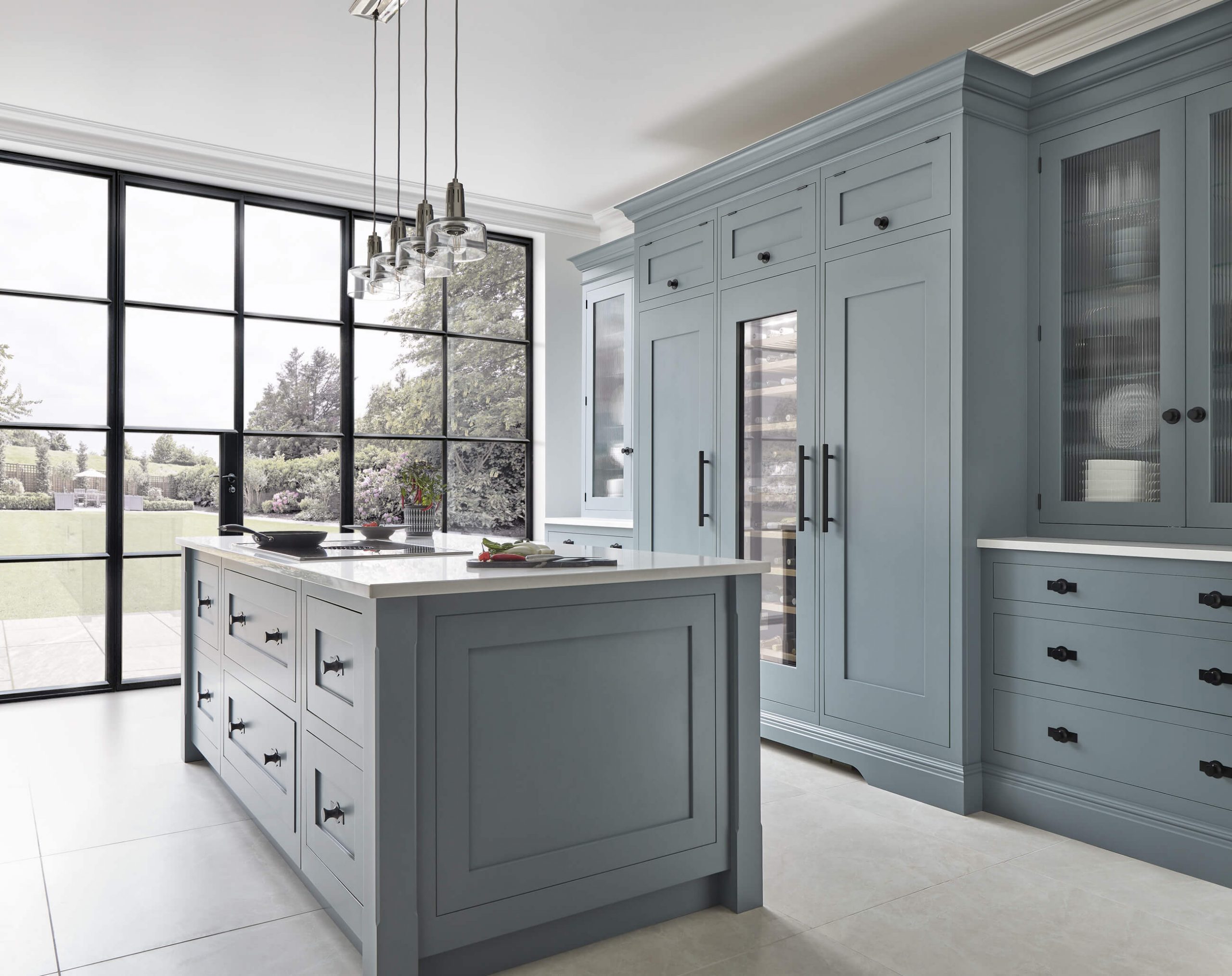

Chosen correctly, colour in the kitchen can have the power to change your perception of a space. It allows you to express your personality and influences us on many levels: both emotionally and physically.
So, where do you start when choosing a kitchen colour? Below we’ve asked six interior experts to share their top techniques and advice on devising a winning colour scheme that works for you and your home.
Colour is a powerful tool. It can conjure a multitude of emotions, change the energy within a space and even influence behaviour. Before pulling together a scheme, you need to think about how you want your kitchen to feel, how you will use the space, and how it flows with the rest of your home. Do you want a stripped-back room that nurtures positivity and calm, a dark and cosy sanctuary or maybe a kitchen full of vibrant colour that energises and inspires creativity?
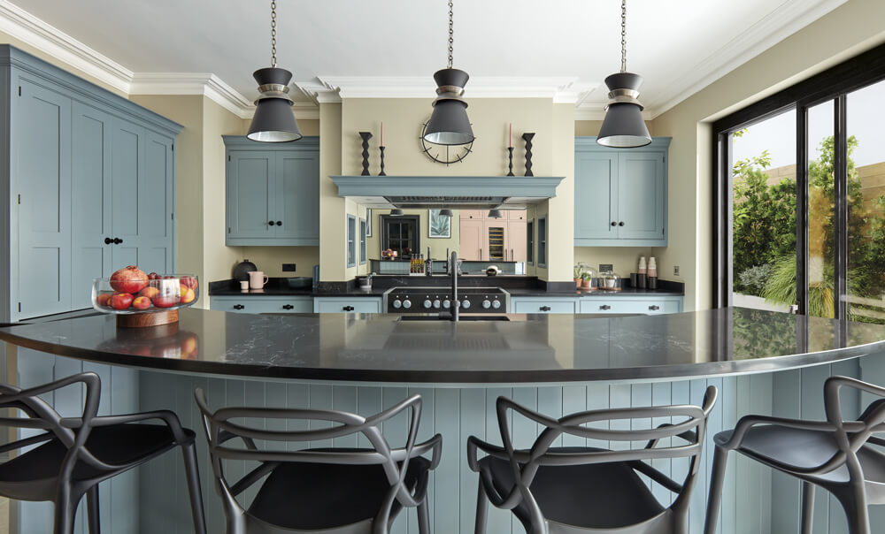
Blues and greens can instil a feeling of calm and tranquillity, both increasingly popular colours as we crave a reconnection to nature and schemes that promote positivity. Black can come across as intimidating; however, it’s the way you use it that changes the feel. This daring colour can look luxurious and courageous while still having a timeless, intimate appeal. An unexpected, more playful alternative to grey, pink can have a wonderful sense of charm and warmth. It’s surprisingly versatile and can be used on cabinetry, tiles, or back panels of shelving if you’re looking to add a little fun without committing fully.
When carefully constructed, a colour scheme can be one of the most defining aspects of a space. Essentially there are four main interior colour schemes: analogous, complementary, triadic and monochromatic. Rather than a fundamental set of rules, they act as a guideline ensuring your space feels balanced. It’s also essential to think about the longevity of your chosen colour scheme ensuring your home looks current in years to come.
Interiors expert Kate Watson-Smyth tells us, “The easiest way to pick a colour scheme that you want to love for years and years is to pick a colour that you love to wear. If you are comfortable dressing in it, you will be comfortable living in it, and there’s a strong chance it turns up again and again in your wardrobe, so you know instinctively it’s a favourite. If your personal favourites are a little too bold for a classic kitchen, then think about painting the insides of the cupboards, so you have a jolt of joy every time you open a door or drawer. Above all don’t choose a colour because it’s “sensible” as firstly you will never love that room the way you need to love it if you have spent a lot of money on it and secondly a colour that doesn’t make your heart sing when you see it will lead to the long slow death of your soul. “
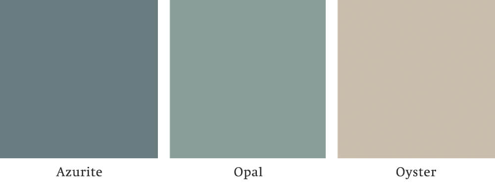
Choosing a colour can often be daunting, with almost endless possibilities. We have 24 Tom Howley colours, all working in harmony, curated to withstand trends and the test of time. Appealing to a wide range of personalities and kitchen styles, you can err on the side of safety by choosing a neutral palette or indulge in your colour cravings with our brilliant brights. The choice is yours.
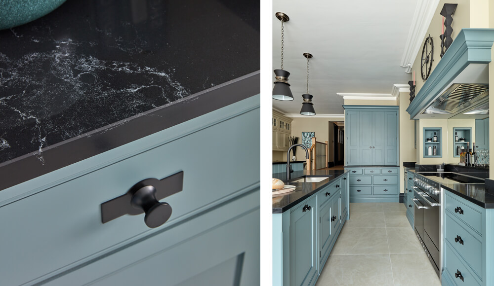
“Opting for colours you love will ensure the longevity of the colour scheme you pursue. Think about colours that excite, inspire or relax you and use them to inform the space. Ignore fleeting trends in favour of your unique connections with colour, using nostalgia, association, cultural reference and travel to bring colour into the home with intention and meaning. Authenticity ages well.” says Andrew Martin.
“I always choose a classic colour for the kitchen, something that will stand the test of time,” says Emma Deterding from Kelling Designs. “Classic doesn’t mean ‘safe’. Make sure you love the colour because the chances are that if you love it now and have always done so, you will love it in the future. Your kitchen designers will understand this and may suggest a palette of colours that fit your brief. Take their advice, listen to what they say, analyse and reflect, and if necessary, paint a board and live with it for a while. If you don’t at least like it at the beginning, chances are it will look tired in years to come.”
Emma adds, “When it comes to making your colour choice, don’t follow the trends. Just because a specific tone is the colour of the year doesn’t mean you have to use it. If you decide to follow the trends or copy your favourite magazine cover, make sure that you try the colour in your space in different areas and different lights. What looked great in your best friend’s kitchen may not look so good in yours! Once you’ve made your decision, try incorporating the colour of the cabinetry into the curtains or some soft furnishings so that it all ties in to create a cohesive and considered look.”
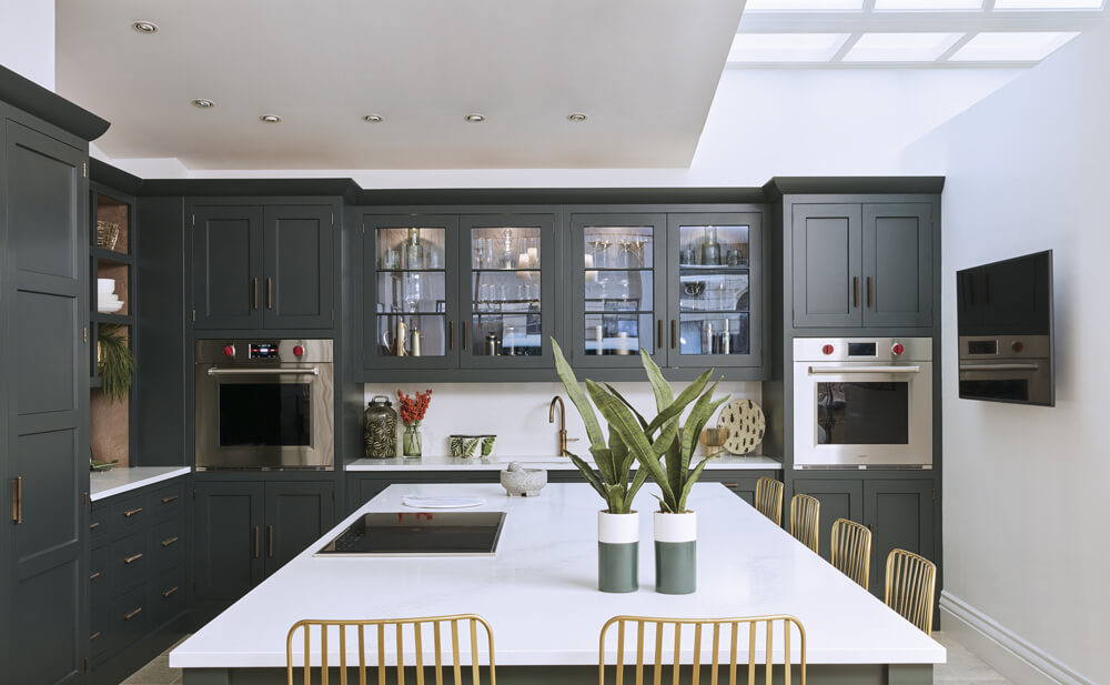
Tom Howley kitchens may be traditional by nature, but that doesn’t mean we can’t elevate our designs through intelligent use of colour. Bold hues from the Tom Howley colour palette are bound to give your kitchen an instant pick-me-up and personality. However, these brave schemes can often be intimidating if you’ve not dabbled in colour before. So, how do you use daring hues with confidence?
Matthew Williamson explains, “Having confidence in bold colour choices doesn’t come naturally to everyone, and committing to a particularly bright or saturated statement tone can feel daunting. The trick is to choose a colour you really love, enhance it and pair it back with complementary and contrasting colour pairings. For example, in a sage green kitchen, you could play with the greens and silvers of sage leaves with cool-toned accents like polished nickel handles and celadon ceramics. To break up the wash of sage, introduce pale pink accessories like upholstered island bar stools or a splashback of blush metro tiles.”
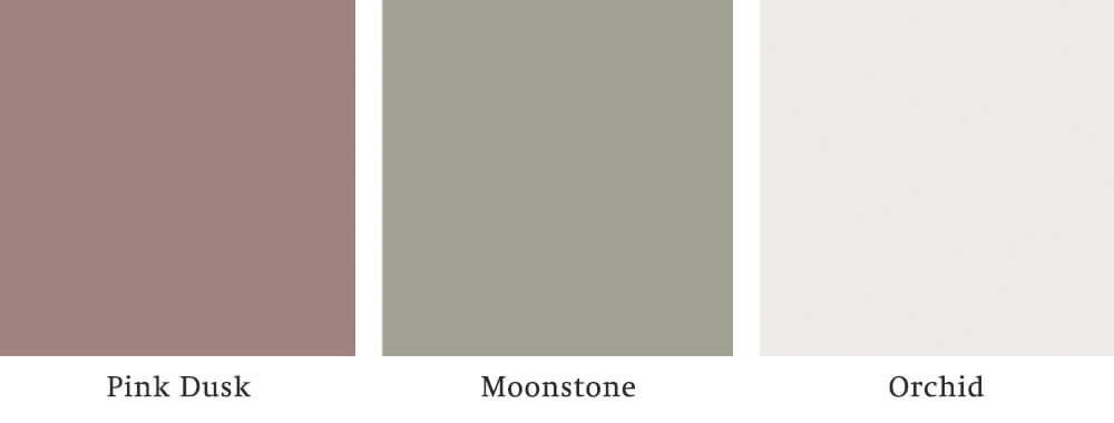
When choosing a kitchen colour, it’s just a matter of discovering what excites you. “My style is best described as carefree and colourful – colour always makes me smile,” says Kit Kemp. “Balance and scale in a kitchen are an important part of the equation. I always look at the plans of a room as a whole and then create a sequence of spaces – a calm area leading into a vivid colourscape. As fewer people now have a separate dining room, the kitchen is often considered the heart of the home and the most important room in the house. Intelligently using blocks of different colours can make a kitchen feel less fitted and much more fun.”
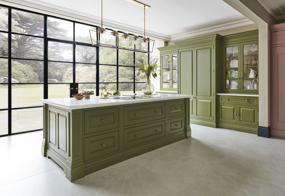
Before settling on colour in the kitchen, you should always consider light from artificial and natural sources. Natural light can add a layer of complexity with factors such as the geographic orientation of a room, seasons, and weather all playing a part in how colour will look in your kitchen.
Stephane Piazza, Project Leader at Apt, explains, “The perception of colour is dependent upon a vast number of varying factors as it is essentially a series of reflections and absorptions. The time of day and the presence of natural light play a big part in how colour is perceived and is intrinsically linked to the sun’s orientation.”
Stephane adds, “Light from the north is generally colder, especially as the intensity of the sun fades towards the end of the day, and so in north facing spaces avoiding muted and grey tones is recommended to prevent spaces feeling gloomy, which can have a negative effect on mood and wellbeing. Light coming from the South, East or West generates a much warmer tone that is maintained despite the reduced intensity of the light towards the end of the day. Here, muted or grey tones can be used.”
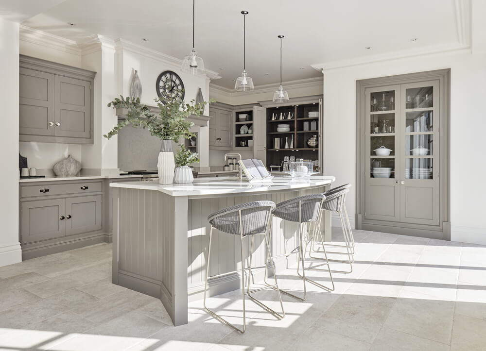
Artificial light should be used to enhance the natural light you already have rather than taking it over with artificial brightness. Keep in mind the temperature of bulbs as they can drastically change the look and feel of a colour. Incandescent bulbs tend to cast a yellow light, making colours appear warmer than fluorescent lights known for giving off a blue-ish, cooler light. LED bulbs are not only more energy-efficient, but they tend to be the closest to natural light, with a variety of shades and dimmable options to choose from.
When choosing a colour scheme for your kitchen, you must consider adjoining rooms to create a cohesive flow throughout the home. Understand what mood you want to evoke and work out whether the colours you choose resonate with your surroundings.
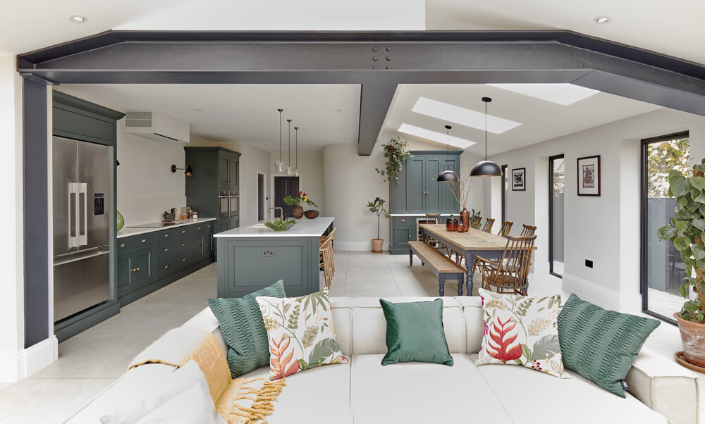
You don’t need to be too precise with this, but making sure there’s some continuity throughout will help rooms feel more connected. An explosion of colour, pattern and texture can create a sense of chaos and unease. On the other hand, one solid colour throughout the home can feel too matchy-matchy. It’s best to use slightly different tones and shades to create a dynamic scheme from one room to the next. You can also choose one dominant base colour throughout, switching up the accent colour with accessories and key pieces of furniture to give each room a personality of its own.
Learn more about our exclusive Tom Howley colour palette and explore our colours in a new light in one of our nineteen nationwide showrooms. Find your nearest here or request a free brochure today.