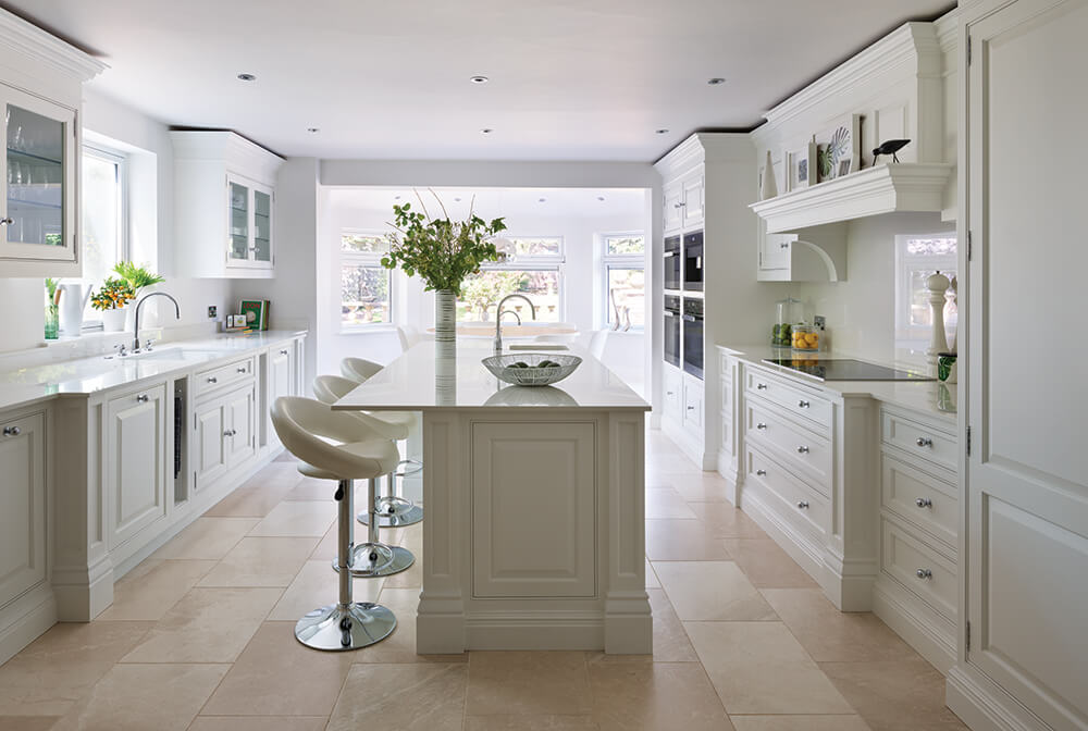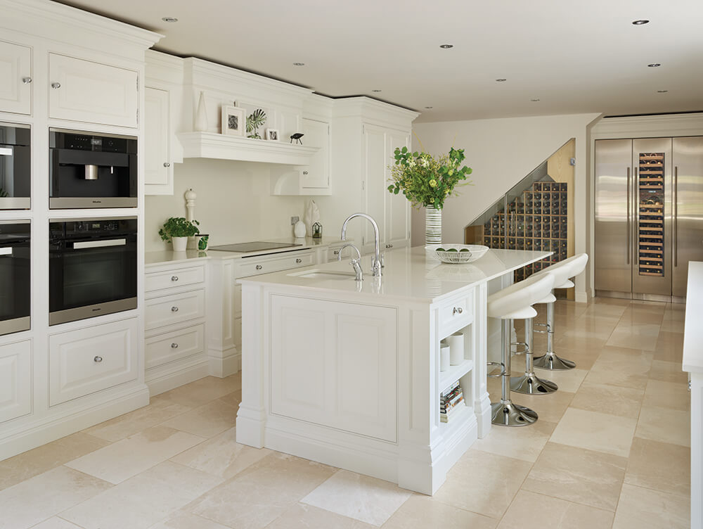

This bright and airy kitchen balances traditional design and contemporary style, ticking every box on the clients’ wish list.
The owners of this leafy Cheshire home wanted to embark on a new project, transforming their outdated kitchen into an open plan hub of the home. With grown-up children and extended family who often visit, a single-storey extension was a much-needed addition overlooking the stunning garden.
They wanted to make the most of this beautiful new space, ensuring its natural light and spacious feel weren’t lost. The solution: a beautifully simple, functional and cohesive kitchen design. A space where the family could spend time, regardless of whether they’re having coffee at the breakfast bar, cooking up a storm at the island or sitting down for dinner around the table.

Our Devine collection was chosen with its traditional lines, cornice detailing and pillars to complement the period home beautifully, adding grandeur to the space. Any multifunctional open plan kitchen needs a clear story of how it should be used. Here, multiple zones were created whilst building up the layers of interest with cabinets, lighting, textures such as worktops, and decor.
Creating different areas with a clever layout will make the space more flexible and comfortable, encouraging you to spend time in it. It’s about getting a beautifully simple, functional and cohesive design that works for you and the space.
Senior Designer, Jenny Thomas.
The couple wanted specific spaces where friends and family could gather, relax and chat while the chef worked their magic, so an island was invaluable, acting as a great stop-gap in the large open plan space. For ease when cooking, they opted for banked Miele appliances. A flexible, functional cooking zone was created by grouping appliances together this way, allowing everyone to use this space simultaneously and seamlessly.

Aware that they wanted to keep an airy, bright feel, plenty of storage was incorporated to help achieve an overall, clutter-free aesthetic. A full-height double pantry and separate breakfast pantry offer ample space to store essential kitchenware and ingredients. As well as providing a streamlined look, a great deal of quality craftsmanship and functionality went into the design of these features. For example, the bi-folding action on the breakfast pantry gives neater, more accessible access to the contents of the cupboards without having to open wide, making better use of the space in this stunning kitchen.
Handcrafted and made to measure, the informal seating area is the perfect accompaniment to the statement island. It gives people a comfortable place to relax and socialise while enjoying the lovely views of the garden. The island also incorporates open shelving to display cookbooks and decor, adding personality and interest to the minimal space.
The beauty of this kitchen is its understated colour scheme. There is a lot of natural light coming in from the garden around the dining area, so the client wanted to ensure the light wasn’t lost when working in the kitchen. Our exclusive paint colour, Sorrel, was chosen along with a soft introduction of a light oak within the interior of cabinets adding warmth to the space.
Creating depth and warmth in a light white kitchen is essential, ensuring it doesn’t feel cold and uninviting. Carefully placed ceiling spotlights provide task lighting, whilst the integrated lighting under the cupboards and inside the glass cabinets gives the room an inviting glow after dark.
If you’re looking for a bit of home inspiration, our brochure is here to help. Full of beautiful real home projects, including some of our latest designs, it’s bound to help ignite ideas.