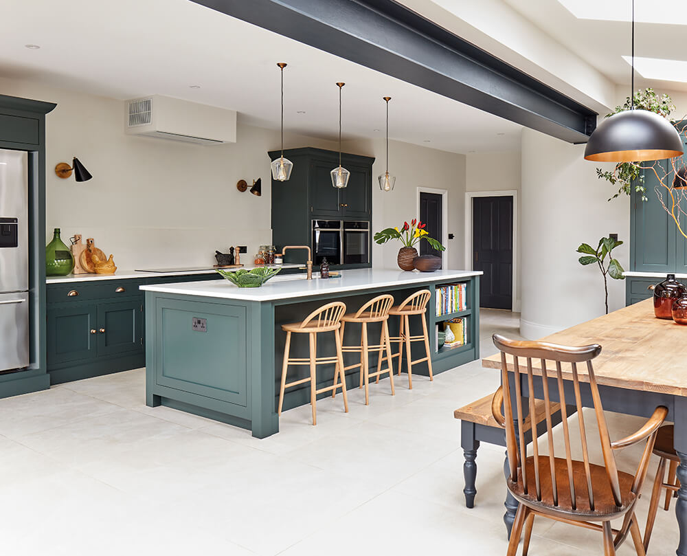

After years of minor renovations and planning, the owners of this striking Edwardian semi decided to delve into a major new project with a Tom Howley kitchen design at its core. Committed to creating their dream family home, the clients removed their existing snug, garage, kitchen and conservatory to make way for an impressive open plan side extension, complete with a larger kitchen/ living area, downstairs bathroom and utility.
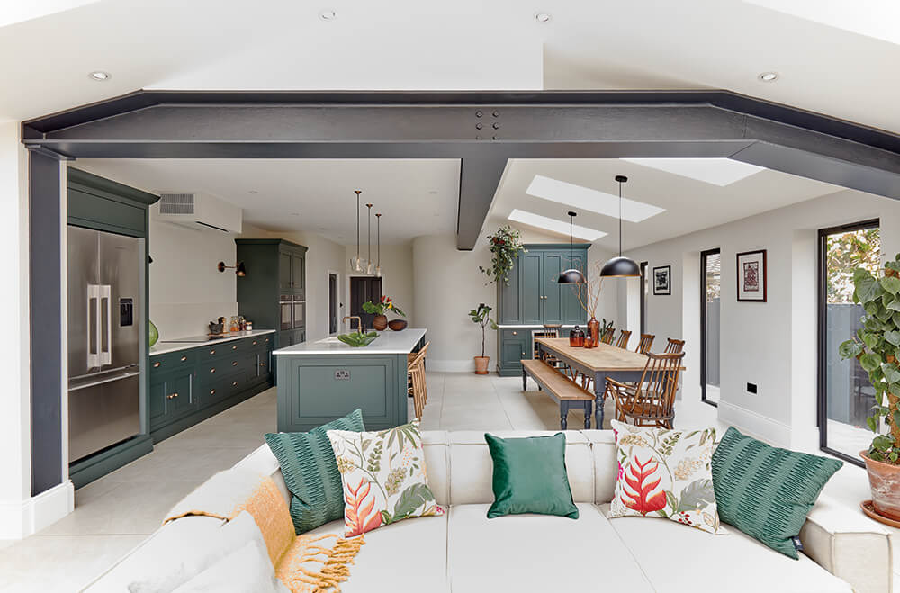
Architects Method Studio took on the challenge of creating a space that worked effortlessly with the existing proportions and original style of the property. With a generous amount of square footage, the design could incorporate striking architectural elements such as an apex roof with exposed steel beams. These steels offer structural support and work to create a slight divide and distinction between zones, which is key when designing a successful open-plan space.
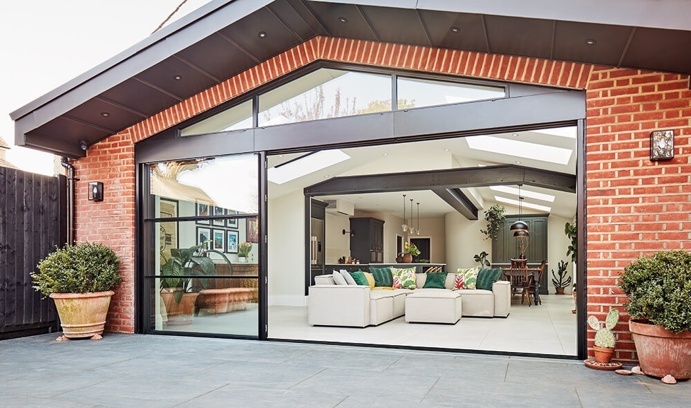
The kitchen is situated towards the back of the newly created extension with a comfortable living zone next to an impressive set of sliding doors. These slim framed glass doors and stunning floor-to-ceiling windows cleverly connect the internal space to the outdoors, pulling natural light through to the back of the kitchen and beyond.
Our brief was to create a relaxed and spacious kitchen, ideal for socialising and spending time as a family. Open-plan layouts are excellent for connected family living but need careful consideration to ensure they work as a whole. From the beginning of this kitchen renovation journey, the clients clearly envisioned how they wanted to approach the design.
We wanted the kitchen to remain ordered, functional and be future-proofed. The look and feel were important, building layers of interest and incorporating an eclectic style that already flows throughout our home. Tom Howley quickly translated these ideas and started answering questions we didn’t even know we had. When we sat down to view the proposed design, we knew they understood the critical ingredients required to create our dream kitchen.
Natasha, @redcliffhouse_renovation.
The space has three main zones – a handcrafted kitchen with an island at its heart, a sociable dining zone, and a comfortable living area with low seating, cleverly separating the individual zones without blocking views of the garden.
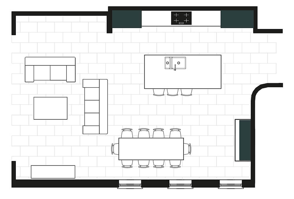
With a keen eye for interior design, it’s no surprise these stylish homeowners chose our distinctive Kavanagh collection to work harmoniously with the extensions’ bold architectural features. This sleek shaker style design is characterised by its functionality, limited ornamentation and simplicity, making it the perfect backdrop for modern family living. The kitchen has a simple layout with the main run of cabinets behind the island flanked by an impressive Fisher & Paykel fridge freezer and two single ovens.
The logic of this kitchen layout is that when the oven, the sink and the refrigerator are in a comfortable position with each other, the whole room will function efficiently. The cooking zone also incorporates a sleek Neff induction hob and minimal extractor design. This extractor style was chosen to ensure it didn’t dominate the space, leaving the focus on the bespoke Kavanagh cabinetry.
An open-plan space can make the most of its footprint by incorporating a beautiful, oversized island at its heart. The clients love entertaining, so the island needed to be positioned overlooking the dining table, allowing them to connect with guests and family members.
The island’s 304cm x 134cm size allowed room to incorporate many practical solutions, including an under-mount sink with a burnished brass Quooker tap, intelligent storage, a dishwasher, pull-out bin and stunning Ercol bar stools. Not only is the island functional, but it’s also imbued with a sense of personality. At the same time, open storage creates the perfect space to display books and eclectic decor collected by the family.
The island is everything we envisage and more. We wanted it to be the main hub of the kitchen that was highly functional with strikingly good looks too.
Natasha, @redcliffhouse_renovation.
A bespoke bifold pantry was built to maximise storage, helping to achieve an overall clutter-free aesthetic. With an integrated mQuvée wine cave, work surface space and ample shelving, everyday essentials can be accessed easily and hidden away for impromptu visits from friends and family. The doors bi-fold action gives neater, easier access to the contents of the cupboards without having to open wide. Its grand proportions and positioning help define the dining zone, successfully linking the two areas together.
You’ll find a considered colour palette throughout the home, stylishly layered with vintage pieces and curated houseplants. It’s this creative, eclectic style that the clients wanted to carry through to their kitchen. Another goal was to bring the outside in with lots of tonal greens and textures, creating a positive, inviting feel.
Our striking Avocado paint colour marries beautifully with crisp Caesarstone Organic White work surfaces, striking a balance between traditional aesthetic and contemporary flair. By pairing Avocado with soft neutral Botticino Marble flooring and Farrow & Ball Strong White walls, an aesthetic was formed that’s not too harsh or too cold. Cup and plain knob burnished brass handles add warmth and offset the matte paint finish, bringing the kitchen to life.
If you’re looking for a bit of home inspiration, our brochure is here to help. Full of beautiful real home projects, including some of our latest designs, it’s bound to help ignite ideas.
You can explore more of this stunning home by following @redcliffhouse_renovation.