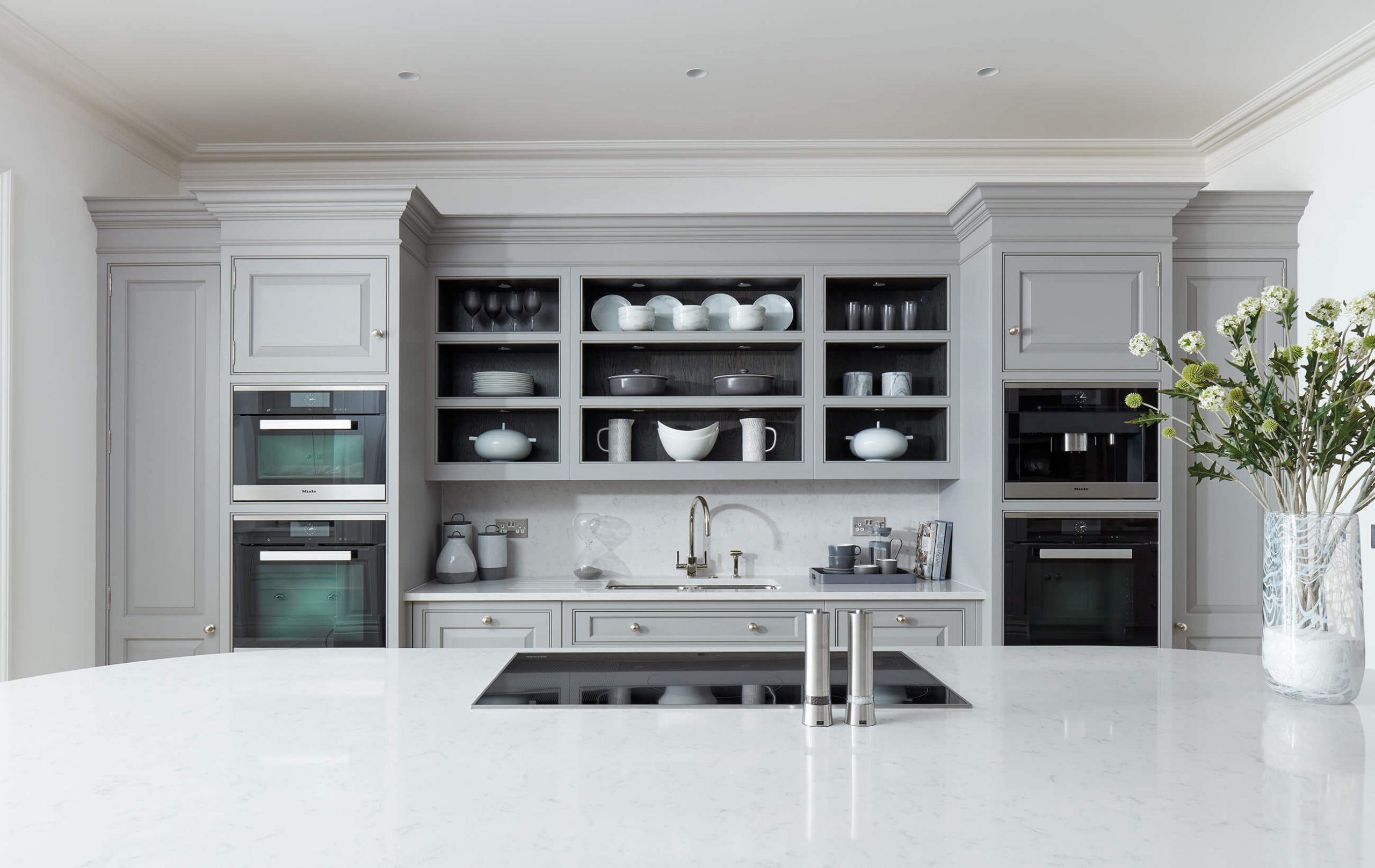
Tom Howley Kitchen Design Service – What to Expect
Tom Howley offers a complimentary kitchen design service aimed to bring your visions to life. During a visit to one of our beautiful showrooms, our designers will take the time to listen to your hopes and desires. Only through this process of understanding your lifestyle and your home’s surrounding environment can we produce a kitchen design that perfectly complements each of these vital aspects.
Beautifully Bespoke
Tom Howley kitchen designs are bespoke to you and your home. For example, if you see a design in our showroom or brochure, please bear in mind that this is simply to give you food for thought. Challenging features such as chimney breasts, sloping ceilings, alcoves or large windows can all become assets and enhance the look and individuality of your space. If you’re dreaming of an organised pantry, we can utilise awkward nooks or empty walk-in cupboard spaces; we can even tailor your utility room or living space to match your kitchen, creating one seamless flow.
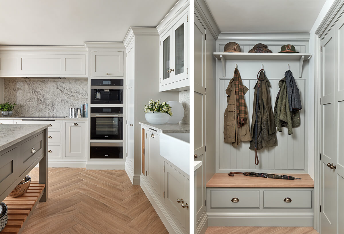
Top tip: We highly recommend planning the kitchen before building work starts when planning an extension or complete overhaul of your space. This allows our designers to explore numerous layouts. Each kitchen is beautifully crafted for a millimetre perfect fit, so small changes further down the line can have a considerable knock-on effect if not appropriately planned from the start.
The Design Journey
There’s no ‘one size fits all’ when it comes to a Tom Howley kitchen. Our talented designers will work closely with you from the beginning of your kitchen renovation journey to understand your needs and lifestyle. This is imperative to a successful design that is not only functional but beautiful too. Each stage of our kitchen design service is expertly managed by our designers, from your initial appointment to the final adjustments, until you are completely satisfied that we have achieved your vision. Preparation is key to a successful initial design meeting. So, to help you start on the right foot, our designers have compiled a list of essential points to consider, prepare and bring with you.
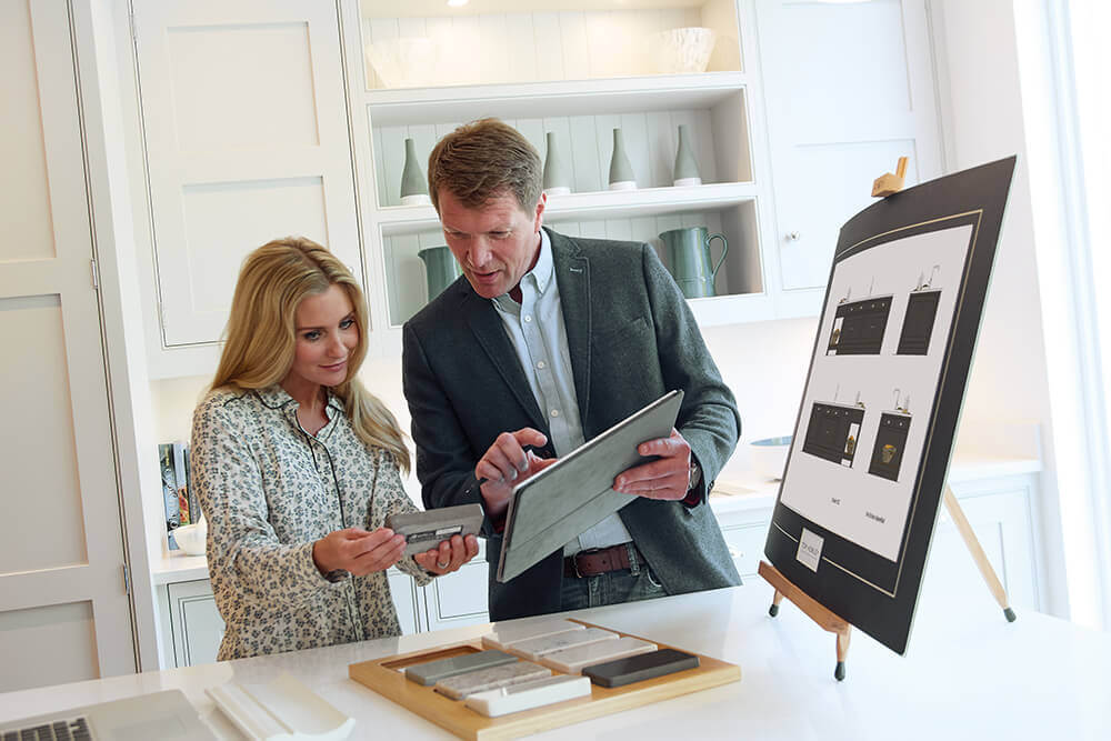
What to Bring With You to a Design Meeting
A kitchen renovation is one of the most exciting and yet time-consuming projects you can undertake, making it easy to get carried away with unnecessary details, missing crucial steps along the way. The more information the designer has at the initial meeting, the better, whether this is with regard to aesthetics or practicality.
- Any architect plans and room plans with dimensions. In the case of a new build or extension, there may be no other option, but being involved early in the planning stage allows us to make suggestions, enabling you to have design features or the latest appliances you crave. Ideally, it is good to know the location of services, electricity, and water/waste at an early stage of any new build. They need to be positioned accurately, especially if an island forms the kitchen’s focal point.
- Your kitchen wishlist. One tip is to take a look around your existing kitchen and note down the pros and cons of the space as it is. This will act as your base. Aside from everyday practical requirements, you should also draw up a list of design elements that you may need in the future, ensuring your kitchen has longevity. Maybe you’ve dreamt about an integrated family seating area, space for a large dining table or top of the range appliances. Write all of this down.
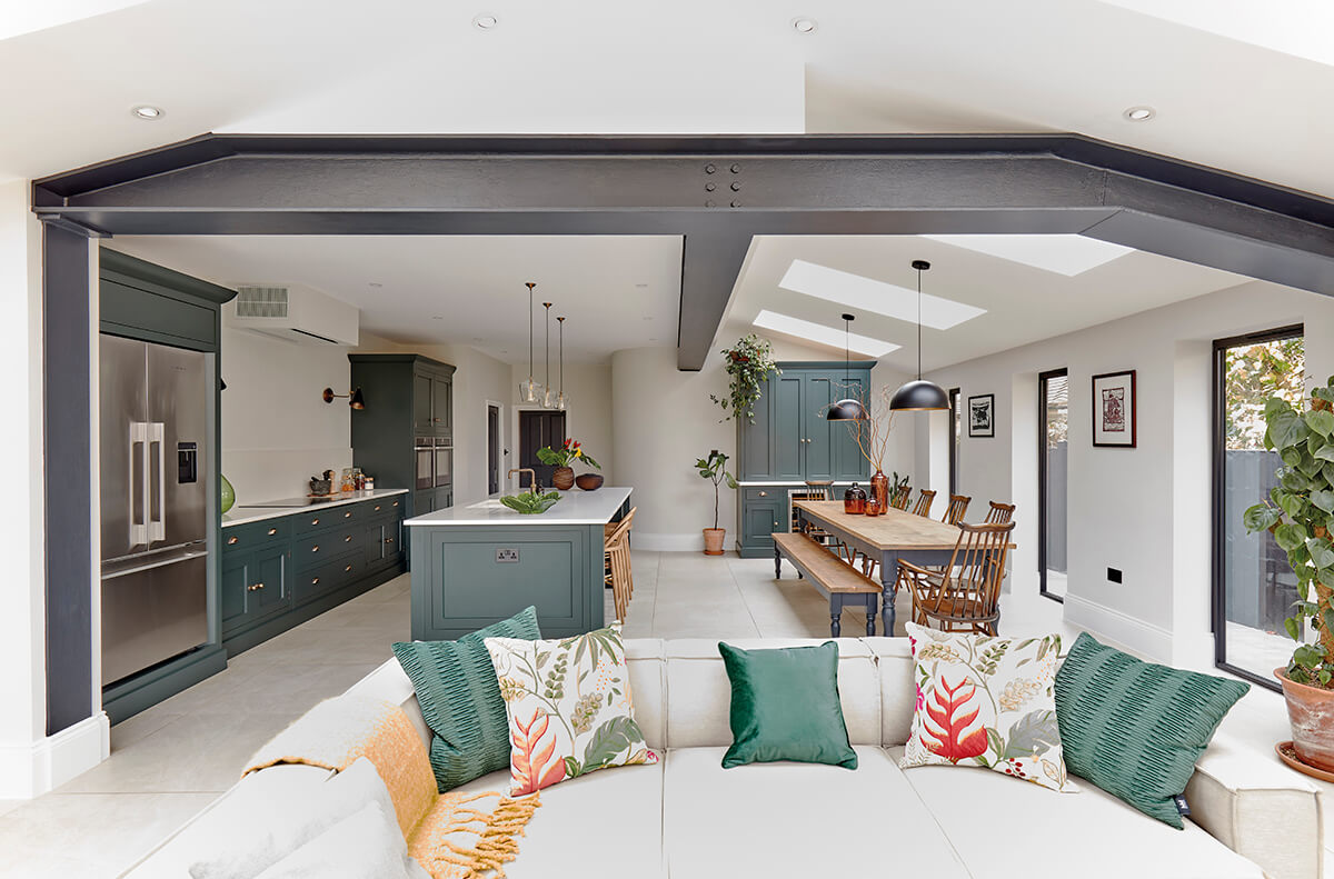
- Any mood boards you have created to support your ideas for the kitchen. I.e. Pinterest boards, Houzz profiles, magazine cuttings, images from our brochure. Mood boards are just as important as your initial design wishlist. They are one of the easiest ways to showcase your home interior inspiration and convey your design ideas visually to a kitchen designer. You can read our guide on collecting and curating your own kitchen mood boards here.
- All parties involved need to make sure they have approximately 2 hours available for initial brief meetings. These meetings with our designers are one of the most important in the process. They are where your wish lists are discussed, and ideas are turned into reality.
- An open mind. This ensures we are able to create a beautiful, brand new space, which not only reflects your home but your lifestyle too.
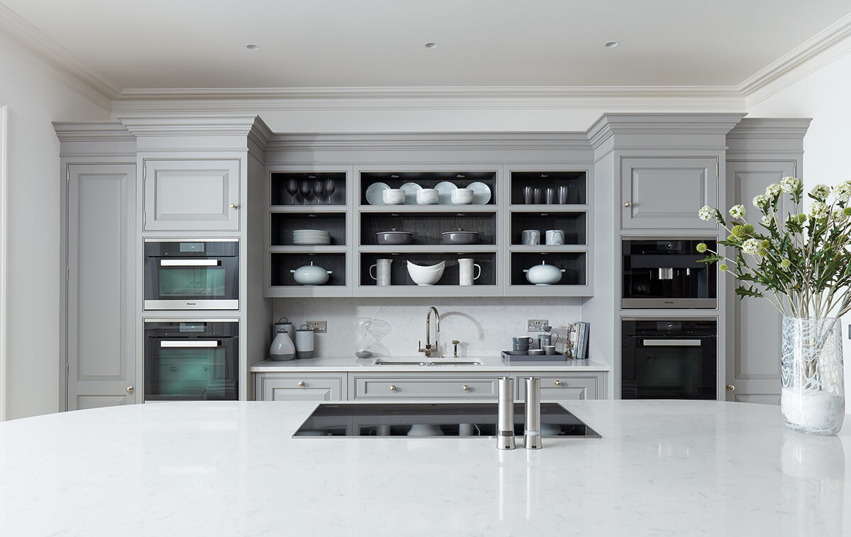
- A rough budget will help you make informed decisions and prioritise certain aspects of the design from day one. Budgets are project-specific and partially dictated by the size of the space and client requirements. If you are hiring trades, you’ll need to factor in a budget for building work, painting, tiling, flooring, plumbing, electrics and any extra fixtures on your wishlist. During the design process, we will give you a breakdown of the kitchen costs allowing you to feel comfortable and in control every step of the way.
Plans and Visualisations
The Tom Howley design philosophy is to create beautifully proportioned spaces designed for how you want to live. This core value is shared by each of our designers, all of whom work to the same exacting principles with unerring passion and dedication, ensuring no kitchen that is ever created is anything short of exceptional.
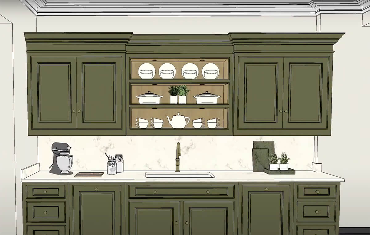
Once we have all the details, floor plans and elevations, we will create a virtual, three-dimensional walk-through of your kitchen. This allows you to see in superb detail exactly how your finished design will look and to make fine adjustments until you are completely satisfied that we have achieved your vision.
Beautifully Crafted and Installed
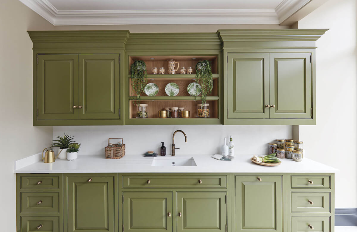
Every Tom Howley kitchen is beautifully crafted for a millimetre perfect fit. To achieve such an exact result, our surveyors carry out a meticulous series of measurements throughout the process that leaves nothing to chance. Even the tightest of corners and tricky alcoves can house clever cabinetry leaving no space wasted.
Once you’ve committed to a final design, we don’t just walk away and let it take care of itself. From installation to the final lick of paint, the whole process is scrutinised to the last detail to ensure that you’re delighted with your new kitchen.
Booking Your Free Consultation
If you’re looking to transform your home, now is the perfect time to invest in an exquisite, handcrafted kitchen that will exceed your expectations.
Our tailored kitchen design service will take your project from concept to completion. For more information, call into your nearest showroom.
