

By knocking down walls and working closely with Tom Howley kitchen designer Jenny, owners Nick and Jay transformed the ground floor of their 1900s Edwardian home into a modern central hub where family and friends could come together.
The rear of the property was originally split into separate rooms; however, this didn’t suit the couple’s lifestyle. They wanted to create a relaxed open plan, kitchen and living space, ideal for socialising, cooking, lounging and working from home. To achieve this flexible layout, internal walls were knocked down, Crittall-style doors added, and brick-slip feature walls installed to achieve the perfect backdrop for contemporary living.
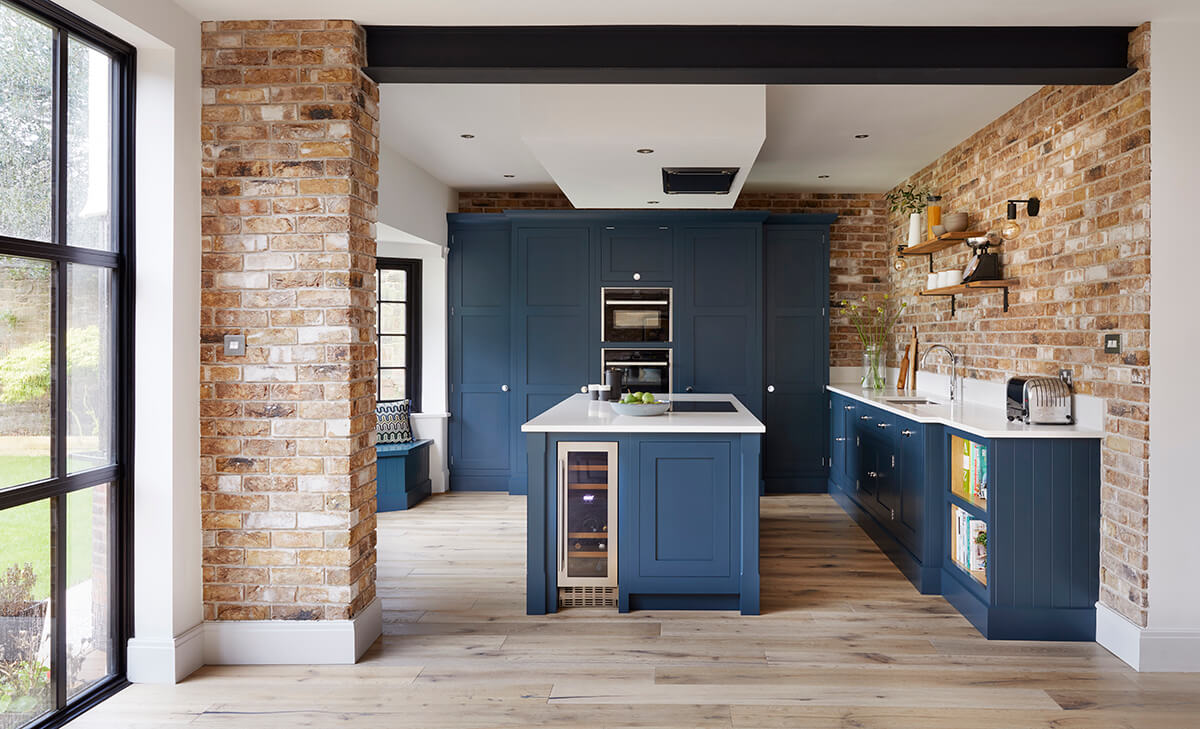
Their vision was based on an existing Tom Howley design that they had seen and loved, featuring exposed brickwork and a dark colour scheme. Although the aesthetic was clear, Nick and Jay needed guidance spatially to maximise the potential of their space. Playing to the room’s strengths, Jenny, one of our talented designers, helped them achieve their vision. As the kitchen needed to work cohesively with the rest of the open-plan space, prioritising elements of the design was crucial for its success.
With its strong, clean lines, our Butler collection offered a modern update on the Shaker-style kitchen. Traditional details are still subtly visible within this collection, such as the detailing in the cornice and skirting, ensuring that the style stands the test of time. This fusion of classic craftsmanship with a modern edge was just what the couple had envisioned for their newly renovated period home.
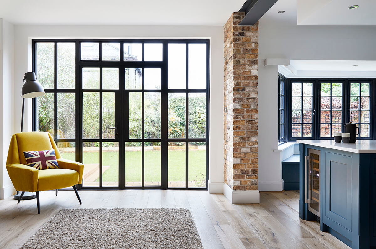
To make the most of the available space, this blue kitchen design needed to be planned to perfection. Symmetry and balance is a tenet of Shaker design that Jenny clearly displayed within the wall cabinetry and banked appliances. As well as being easy on the eye, the cabinetry along the back wall hosts an abundance of practical storage, including a cleverly concealed pantry, creating much-needed space for essential food items and utensils.
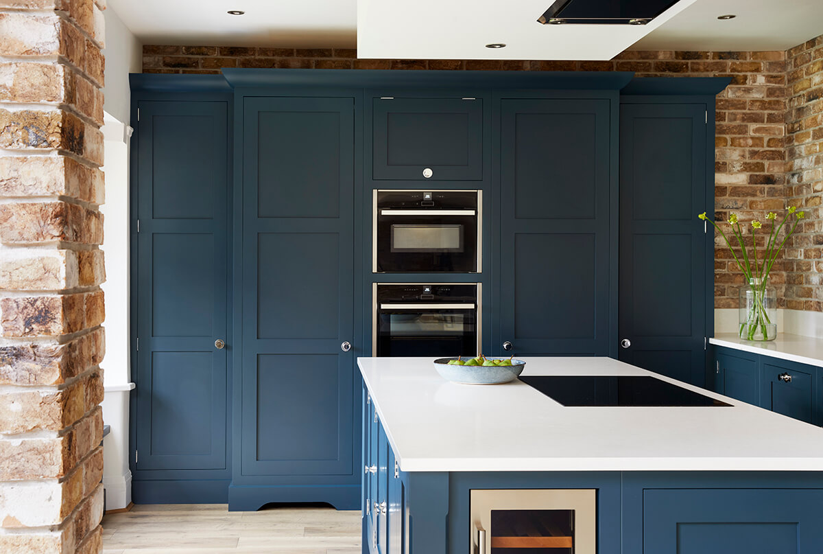
When designing the scale and position of cabinetry, I prefer the main bones of the design to be symmetrical; then I like to throw it all off to stop it looking too clinical. Here, the wall of tall cabinets is perfectly symmetrical, centred neatly on the ovens, but a single open shelf unit deliberately unbalances the sink run.
Jenny Thomas, Senior Kitchen Designer.
Making the right design decisions early on allowed Nick and Jay to create a multifunctional kitchen perfectly suited to their lifestyle. The ‘working triangle’ is one principle that was used to build defined zones, essential for creating flow and ease of use. Unless you never leave a single dirty pan or plate waiting by the sink, installing a sink in the island should be avoided. A Franke undermount sink and Quooker tap was instead designed to sit on the low rise cabinets next to the brick-slip feature wall.
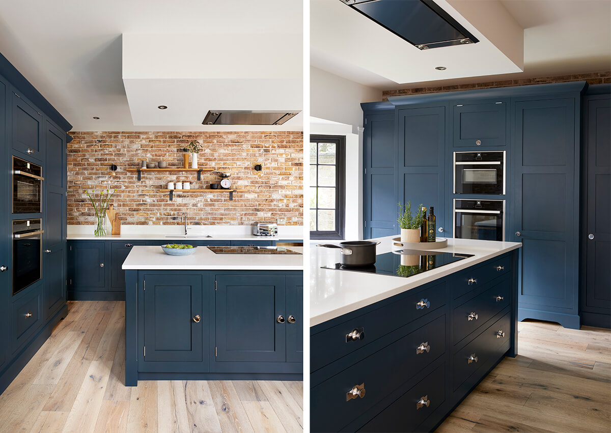
The island is undoubtedly the focal point in this blue kitchen design, acting as the central cook zone and social hub. The shape follows the room’s orientation, with the longest edge running parallel with the brick-slip wall. The position of the hob allows the couple to engage with guests sat at the window seat and is perfectly placed to admire garden views.
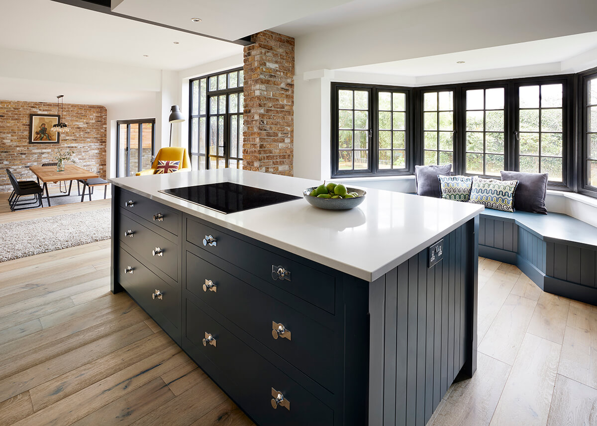
Islands with these proportions are great for adding additional storage. This specific design includes bespoke drawer inlays, deep-pan drawers, and cabinets to house day-to-day kitchen essentials.

On Nick and Jay’s wishlist was a wine fridge on the island. However, sociable seating wasn’t off the cards and with a large window directly facing the kitchen, it was the perfect space to include a built-in window seat. This unique feature is finished in the same deep blue as the kitchen drawing attention to the stunning window.
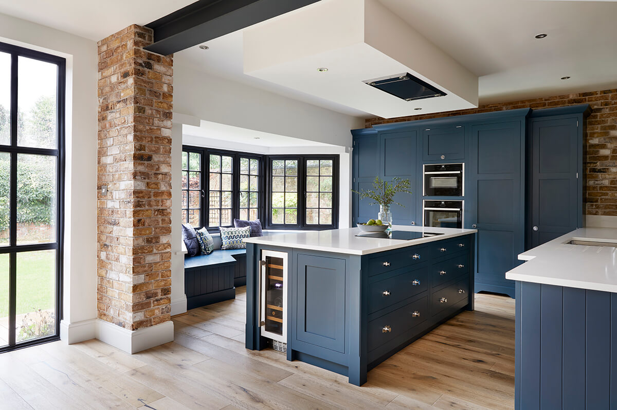
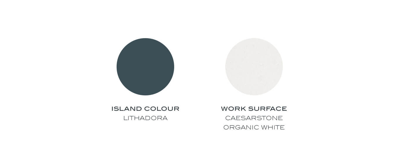
The blues in our colour palette work harmoniously with the rest of our neutrals, allowing you to use them as either one block colour or as an accent. Our beautiful bold blue, Lithadora was chosen to give this Butler design a whole new dimension. We often see this striking blue used as an accent on islands; however, used on the entire kitchen, it amplifies the design adding depth and sophistication to the space.
Darker blues such as Lithadora are making a splash within the interiors world at the moment and can create a strong visual impact, especially when contrasted with warm woods and soft whites. To add a contemporary edge, polished chrome finishes were chosen for the taps, hinges and handles, providing a subtle contrast and sharpened appearance next to the deep blue palette.
Although storage was tight, keeping the beautiful brick-slips clear of wall cabinets above the sink was important to ensure they made a strong impression.
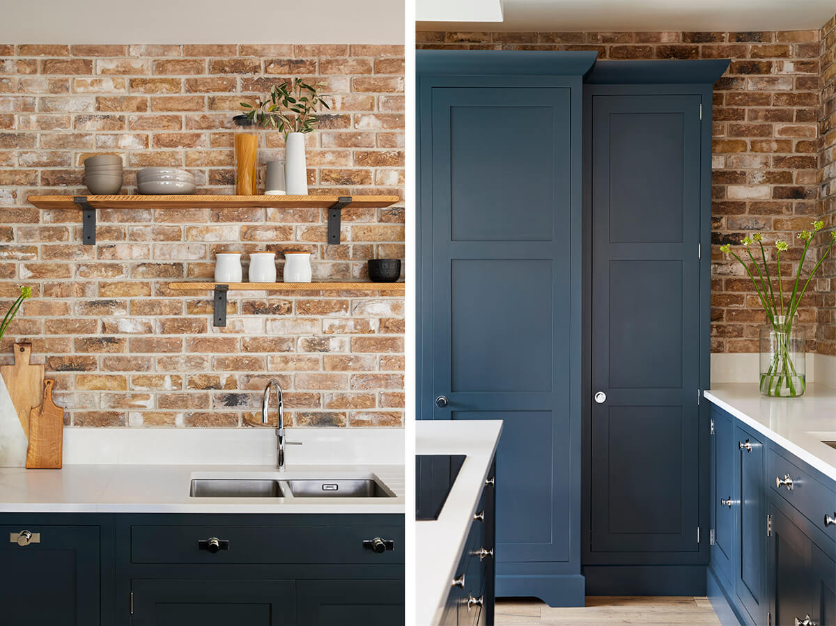
Many people may shy away from open shelving as a storage option fearing that it may leave the kitchen looking cluttered or untidy but, done well, it helps to open up the kitchen and create a sense of space. This blue kitchen design is the perfect example of how open shelving can make a real statement. Made out of natural wood, they add a slight industrial touch to the space without appearing too harsh on the eye.
When it comes to styling open shelves like this, a key point to note is not to jumble too many pieces together. If you are stacking items, make sure that they are of the same or similar design, colour or tone. A simple trick is to find a ‘skeleton’ piece and then place objects of a similar style or colour around it. Remember to stand back and judge the display’s balance and symmetry and bear in mind that empty spaces are as crucial as filled spaces in your composition.
If this blue kitchen design has caught your eye or you’d like to find out more about how our striking kitchen designs can work in your home, request our latest brochure or arrange a free home design visit today.