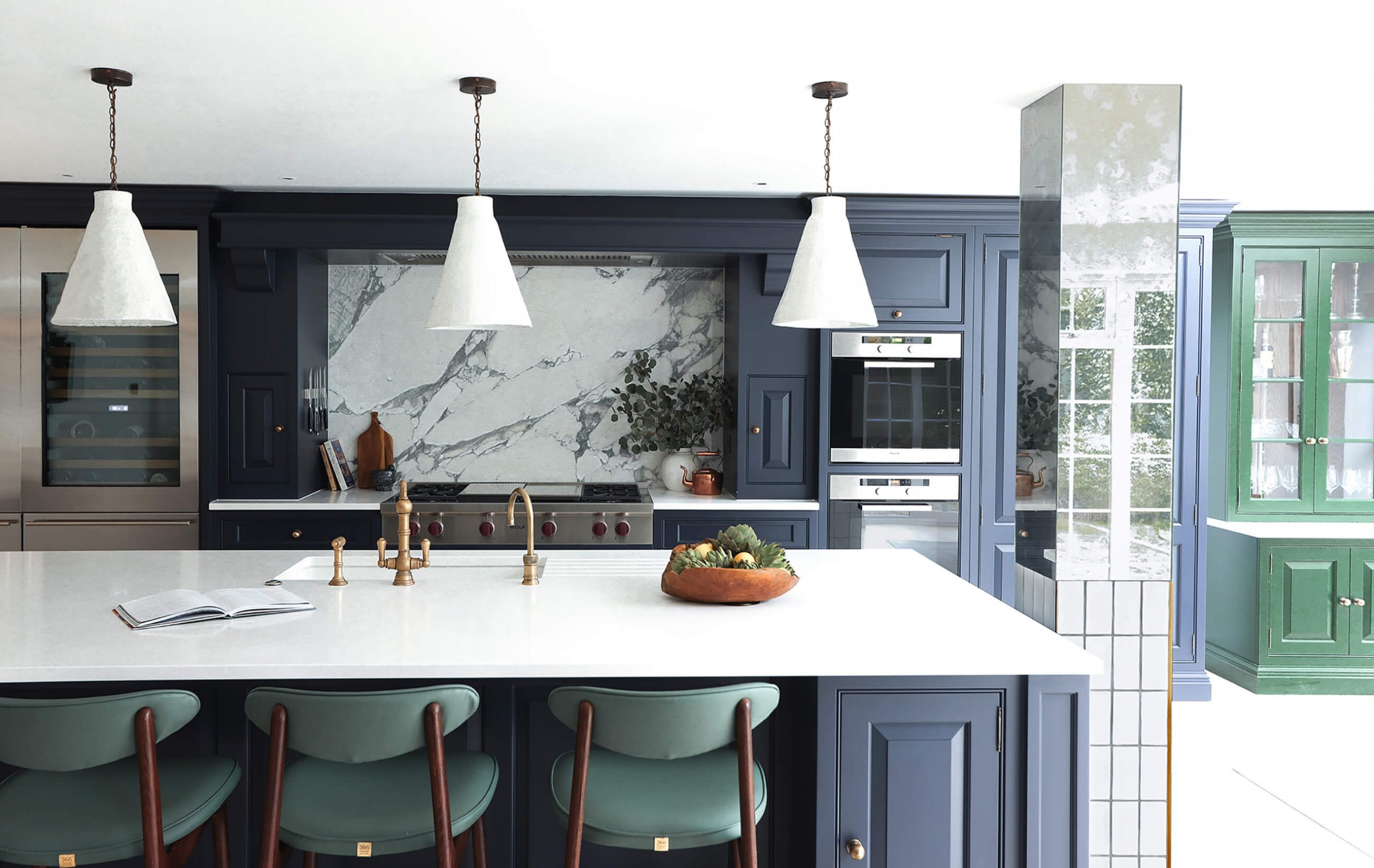

We recently teamed up with London based, young interior design studio House of Sui Sui on a stunning project in the Hertfordshire countryside. Their underlying focus is similar to ours here at Tom Howley, to enhance the quality of life through design. House of Sui Sui does this through creating beautiful interiors that bring wellbeing to the forefront, creating spaces that achieve a sense of peace and happiness.
Part of a full home refurbishment which the interior design studio spearheaded included a complete renovation of the kitchen. We couldn’t wait to catch up with Melissa from House of Sui Sui to hear her ideas and inspirations behind this colourful, artisanal kitchen with family life at its core.
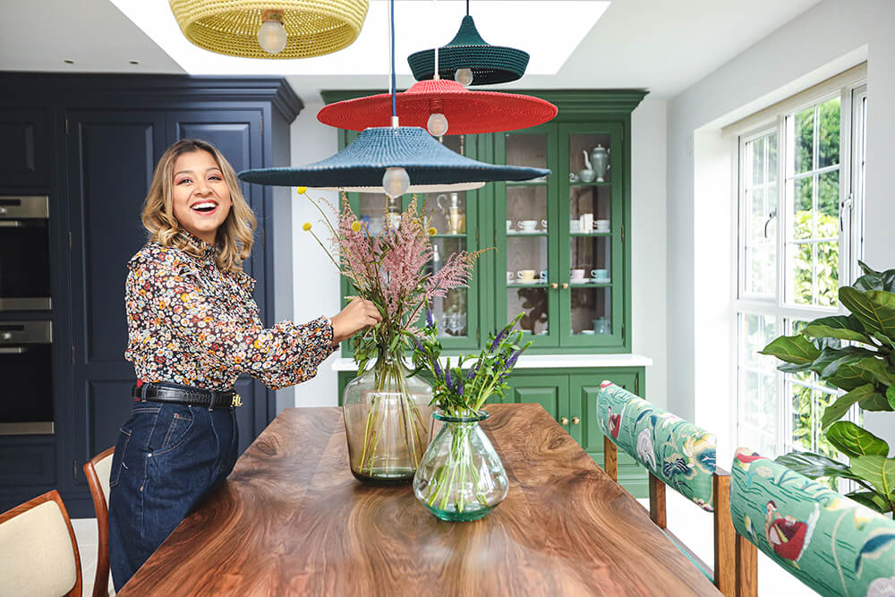
With busy lives, three kids and a dog the space had to be functional, but it was also important for it to have heart. When I asked the family what the space should feel like, they responded with “Waffles and Pancakes” I loved this, for me, it captured the happiness and comfort of family life. I held onto this phrase while designing, and it became the foundation of the brief, a happy, homely place where memories are made.
The kitchen and dining spaces sit together in an open plan layout under an orangery looking out towards the garden. One of the design challenges was how to successfully define these two areas. The use of colour and the allocation of lighting and art played an integral part in the successful zoning of these spaces emphasising their individual functions to make the most of the large open plan space.
Have fun with it, don’t be afraid to use colour, for example, we used two different colours within this design, this not only gave the illusion of a much bigger space, but it also created a unique feature. The kitchen is the soul of the home, and it should reflect the vibrancy of your life.
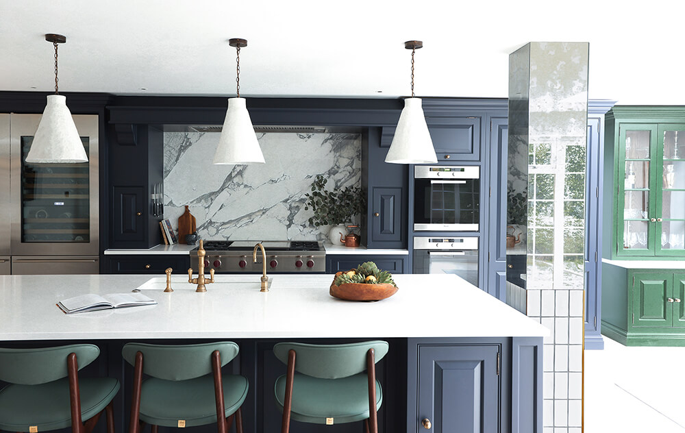
The kitchen is one of the biggest investments in the home. Therefore it was important that the paint finish on the cabinetry would withstand trends and the test of time; simultaneously, it had to be breathtaking, unique and reflect the personalities of the family. We opted for a classic navy blue, in a dark almost blackish shade which created a classic but contemporary feel. We discussed the options of going brighter however came to conclude on a darker finish as it would allow the layering of more colours and act as a grounding shade for the rest of the free-spirited palette.
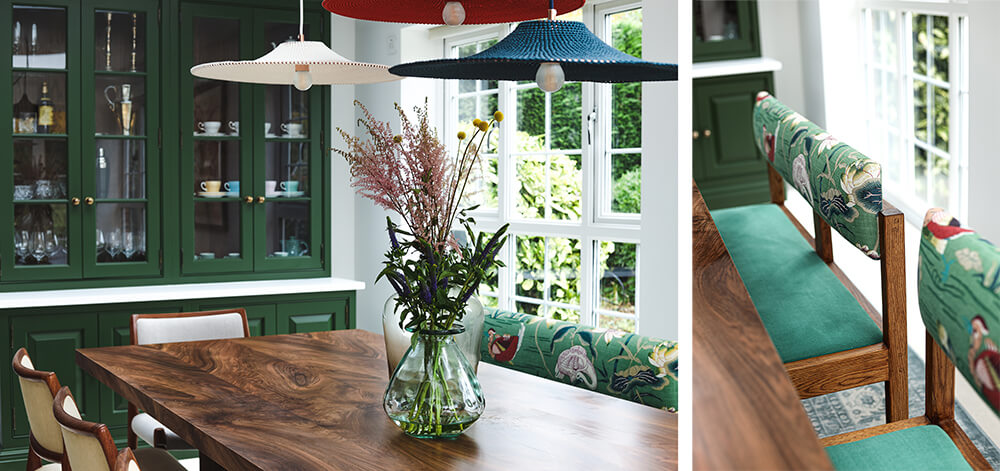
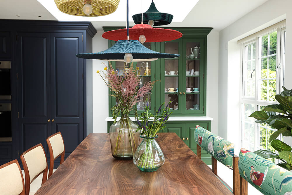
The dining space sits within the large orangery, surrounded by colourful flowers and greenery. This became an anchor within the design, my intent being to bring in that greenery and vibrancy. I truly believe in the wellbeing power of nature, and if your space looks on to the garden, incorporating these colours will create synergy between the indoor and outdoor spaces. We selected an earthy, forest green finish for the stand-alone dresser which sits opposite the dining table. The dark oak internal finish contrasts beautifully with the deep green tones. The introduction of the green on the dresser, elevated the kitchen to the next level, the colour is so breathtaking and unique, as you dine you really feel like you are a part of the garden. It creates a special moment for the dining area, one which you should take pride in creating, it’s a space to enjoy time with family and friends and is deserving of a unique design feature.
For me, a space should feel layered and created over time. Using a variety of materials, textures and styles is a great way to create this look. For this reason, I wanted to select dining pendants with a handmade feel. I selected a cluster of colourful handmade woven lights above the dining table, their rare forms and colours create a magical heir; you feel as if you are walking through a Moroccan souk. The ceiling space above the dining table is a great opportunity to create a stunning feature, for something unique, search for lighting that is sculptural and choose pendant lights in different shapes and sizes to create your own unique cluster. I wanted to continue this handmade look above the kitchen island as it needed something imperfect and unique to contrast against the stark counters. This led us to design and commission handmade clay pendant lights, simplicity with a raw edge. Simple elements are needed in your space, but it doesn’t need to be modern or boring!
The ironmongery is the jewellery of the kitchen. It dictates the style and era of the kitchen. The family desired a vintage style country kitchen, so we opted for a vintage style Perrin & Rowe tap and selected classic style, plain knobs from the Tom Howley collection in a burnished brass finish. The warmth of the burnished brass works wonderfully against the dark tones. We matched the finish on the taps, opting for an aged brass finish with a stunning patina, that ages wonderfully over time.
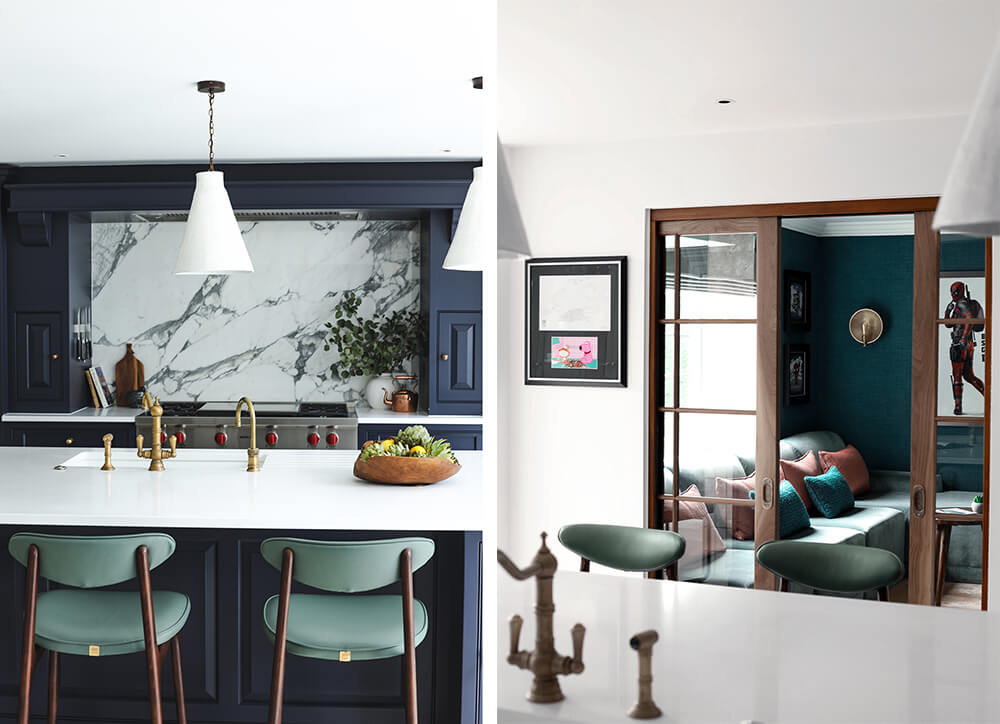
The kitchen needed to have a wow factor; after all, it is where you bring guests and host your parties! The splashback was a great opportunity to do this. We opted for one of nature’s natural beauties, an Arrabescato marble with unique grey veining, our intention was to create a strong contrast with the dark navy, lifting the darkness of the units while simultaneously creating a feature upon entering the kitchen. As the splashback veining was prominent, we decided not to carry the same material on to the counters as it would overwhelm the space. Instead, we matched the counters to the whitest part of the marble, opting for Caesarstone Pure White 1141, which was simple and minimal. As there are a lot of colours within the space, the white counter is a neutral grounder and connector for all of the tones and materials.
House of Sui Sui’s design ethos is based on creating organic and layered spaces, which feel like they have been put together over time. We rejoice in the imperfect. The key furniture and lighting pieces within the space were commissioned and made by artisans and craftsmen whom we collaborated with and listed below. Discover more inspiring kitchen designs by requesting a free Tom Howley brochure, or explore our latest collections by visiting one of our beautiful showrooms today.
Kitchen style: Tom Howley Devine Collection
Kitchen hardware: Tom Howley Round Knobs in a Burnished Brass Finish
Marble Splashback: Arrabescato Marble
Kitchen taps: Perrin and Rowe
Pendant Light Kitchen: Clay pendant- House of Sui Sui X Unit 89.
Pendant Light Dining: Naomi Paul.
Table: Forest Dining Table – House of Sui Sui.
Bench: Gardenia Bench – House of Sui Sui.
Dining Chairs: Vintage Model 80 chairs by Niels Otto Møller, Pamono.
Photography by: www.jackfoxlondon.com