
In 2018, our clients set about transforming their beautiful period home in the heart of the Perthshire countryside. Driven by an ambitious vision, they sought to reimagine both the interior and exterior of their 120-year-old residence, culminating in the addition of a light-filled contemporary kitchen extension.
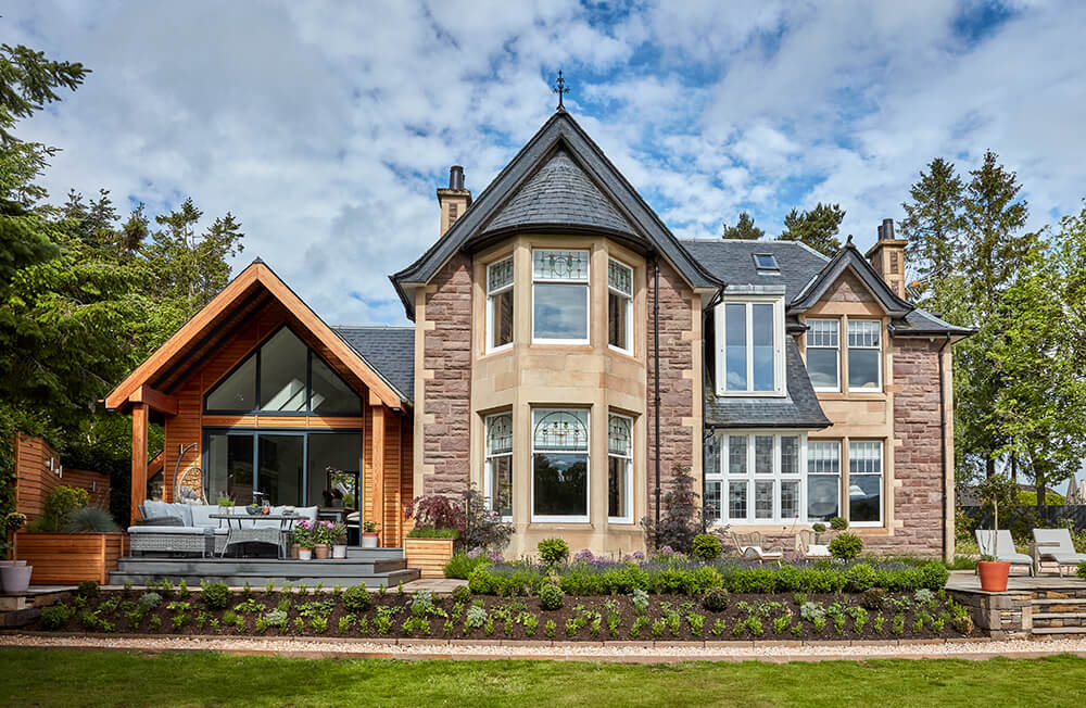
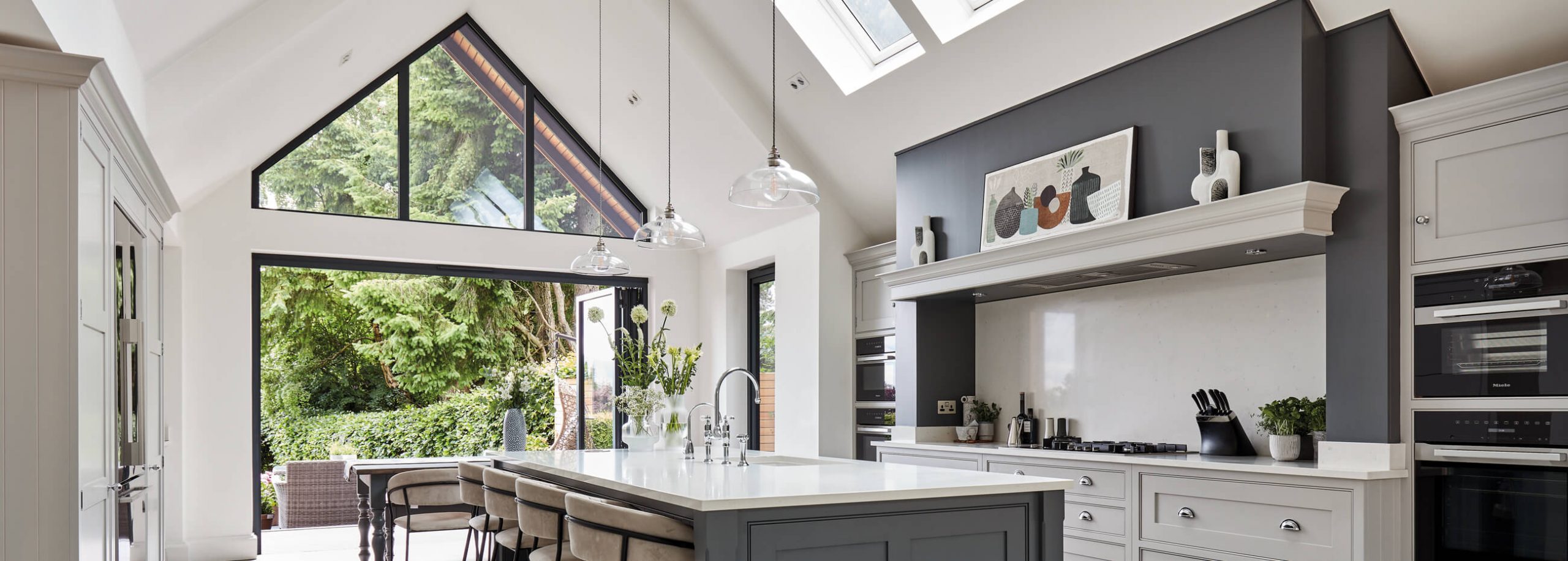
The property now stands in striking contrast to its original state upon purchase. While ideally situated, it lacked a vital space – the core heart of the home – a kitchen where the clients could cook, relax, and entertain. They commissioned a sleek new extension that artfully blended the old with the new, aligning seamlessly with the modern couple’s lifestyle. The double-height space, adorned with an impressive vaulted ceiling, was thoughtfully designed to forge a stronger connection to the outdoors, with skylights and floor-to-ceiling windows at each end maximising the flow of natural light.
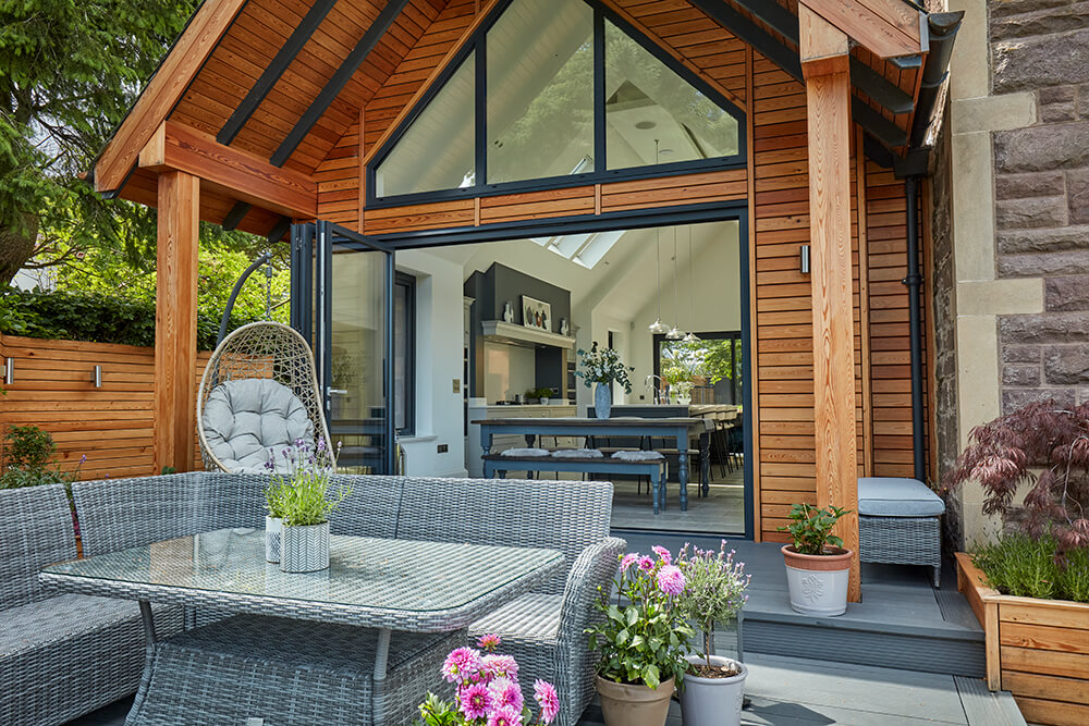
Throughout the new extension, the couple were highly selective with the materials used inside and out. Siberian Larch cladding was chosen for the exterior to create a distinction between the original building. Gazing out towards the dramatic Scottish landscape, your eye catches the warm, rich wood finish, further elevating the kitchen’s visual allure.
Working closely with our talented designer, Richard Horrocks, the clients thoughtfully planned the project while residing in London, even before the extension’s construction. The entire project was conceptualised from architectural drawings, with surveys and meticulous checks ensuring the design was ready for sign-off.
A multifunctional space was a primary requirement for the couple – a place where cooking, dining, relaxation, and entertaining harmoniously coexisted, infused with a light, airy, and open atmosphere. Cabinetry needed to be stylish, well balanced and have an air of simplicity while accommodating all the necessary functions for everyday modern living. Despite having ample space to work with, significant consideration was given to the overall proportion and placement of cabinetry, ensuring the design sat right with the sloped ceiling.
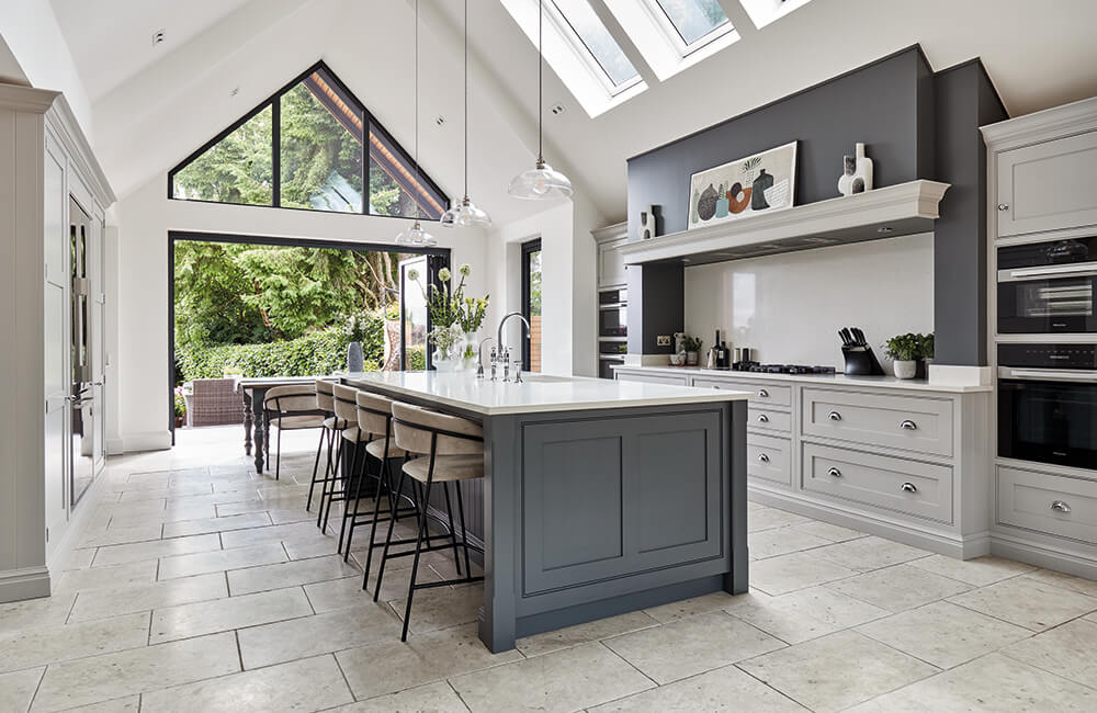
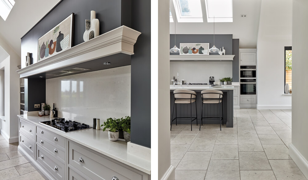
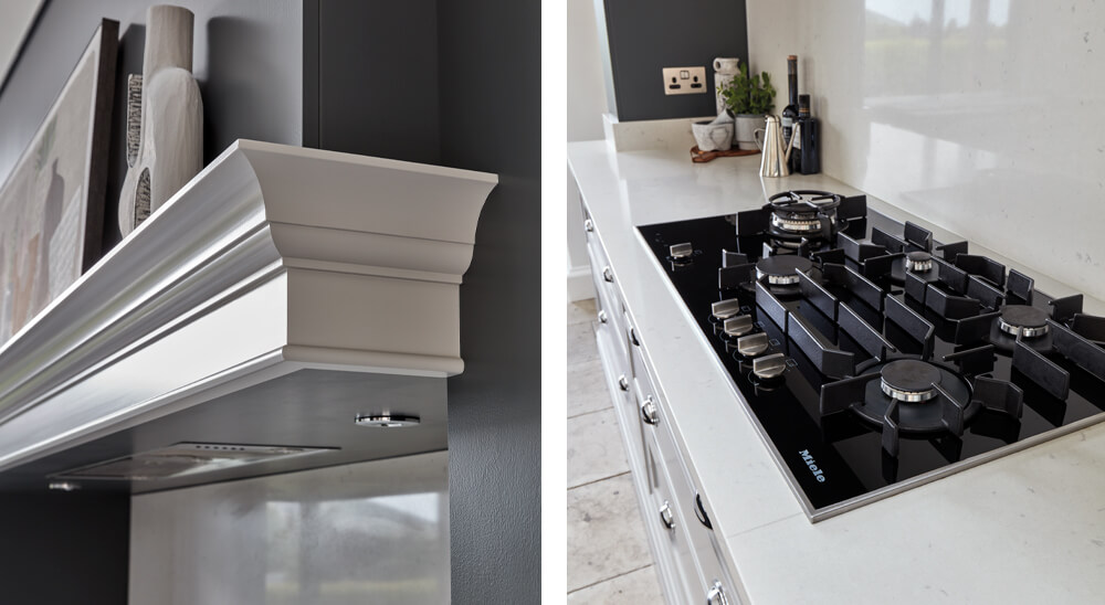
“Right from the beginning, the couple emphasised the importance of the chimney and mantel as the central focus of the design,” Richard explains. “Additionally, tall pantry cupboards and a bi-fold breakfast pantry were high-priority items, providing essential storage that is both impressive and functional.”
Given the prominence of the chimney as a pivotal design element, the entire layout naturally fell into place. Richard mentioned, “The central positioning of the mantel and ovens dictated the overall layout of the cooking area, which in turn inspired the island location and opposite run of storage.” Such logic ensured an efficient flow within the kitchen, where the oven, sink, and refrigerator resided in comfortable proximity.
The extension was thoughtfully divided into multiple zones with a clear story of how each space is intended to be used. At its core, the kitchen is the central functional hub, while one end houses an informal lounge area with a log burner and bi-fold doors leading to an inviting outdoor seating space. On the opposite side of the extension, the dining zone leads your eye to dramatic views through its wall-to-wall windows and doors, easily transitioning to the beautiful patio area for seamless all-year entertaining.

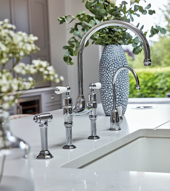
The extension’s ample footprint has been maximised with a distinctive, oversized island at its centre. On one side, the island accommodates four sumptuous curved back bar stools and a Kaelo wine cooler, ideal for entertaining. On the other side, it features practical elements such as a Miele dishwasher, a hidden pull-out bin, and integrated towel storage. Additionally, a sleek undermount sink and boiling water tap have been strategically positioned for easy access to the cooking area and unobstructed garden views.
As Tom Howley Designer, Richard, mentioned earlier, “A multifunctional bifold pantry/bar area was an indispensable addition to the clients dream kitchen, providing ample storage under the retaining beam. This area went through a couple of iterations; the upper section was glazed at one point, but eventually, the decision was made to maintain the blind panels for storage. The wine cooler was an integral part of the design, and this seemed the natural place for it next to the dining area.”
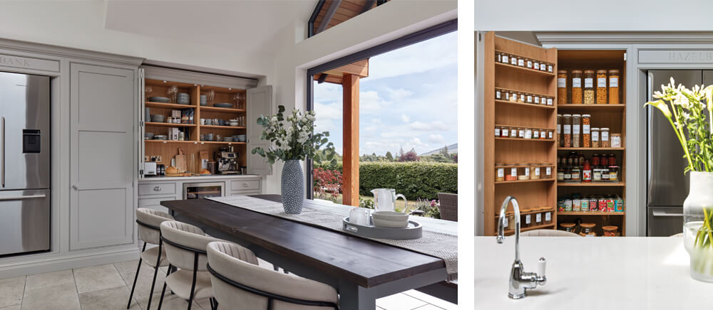
Along with the bi-fold pantry, the main run of cabinetry holds abundant storage opportunities, all hidden behind Hartford shaker doors, ensuring a sleek and clutter-free appearance. Tall pantry cupboards flanking the Fisher & Paykel fridge freezer were tailored to house a myriad of ingredients, impeccably organised within bespoke door racks and adjustable shelving.
Our Hartford collection was carefully selected for its shaker in-frame design, well-balanced proportions, and timeless detailing. Enhanced by exquisite polished chrome cup and plain round handles, this style harmoniously complements the modern extension’s sleek lines and impressive scale, resulting in a truly breathtaking living space.
The clients sought a clean and sophisticated colour palette, initially opting for one contemporary neutral. However, they were captivated by the combination of two shades in our Tom Howley showroom in Dewberry and Thistle. Choosing a darker colour for the island accentuates the feature further and is a great way to add depth. A dark feature wall was also later introduced as a juxtaposition against the lighter mantel and cabinetry. These colours, the play of natural light and surrounding greenery harmoniously intertwine with reflective Caesarstone Misty Carrera surfaces and tumbled limestone flooring, creating the most enchanting atmosphere.
If you’re looking for home inspiration, our brochure is here to help. Full of beautiful real home projects, including some of our latest designs, it’s bound to help ignite ideas.
You can explore more of this beautiful home by following: @maxs_manor