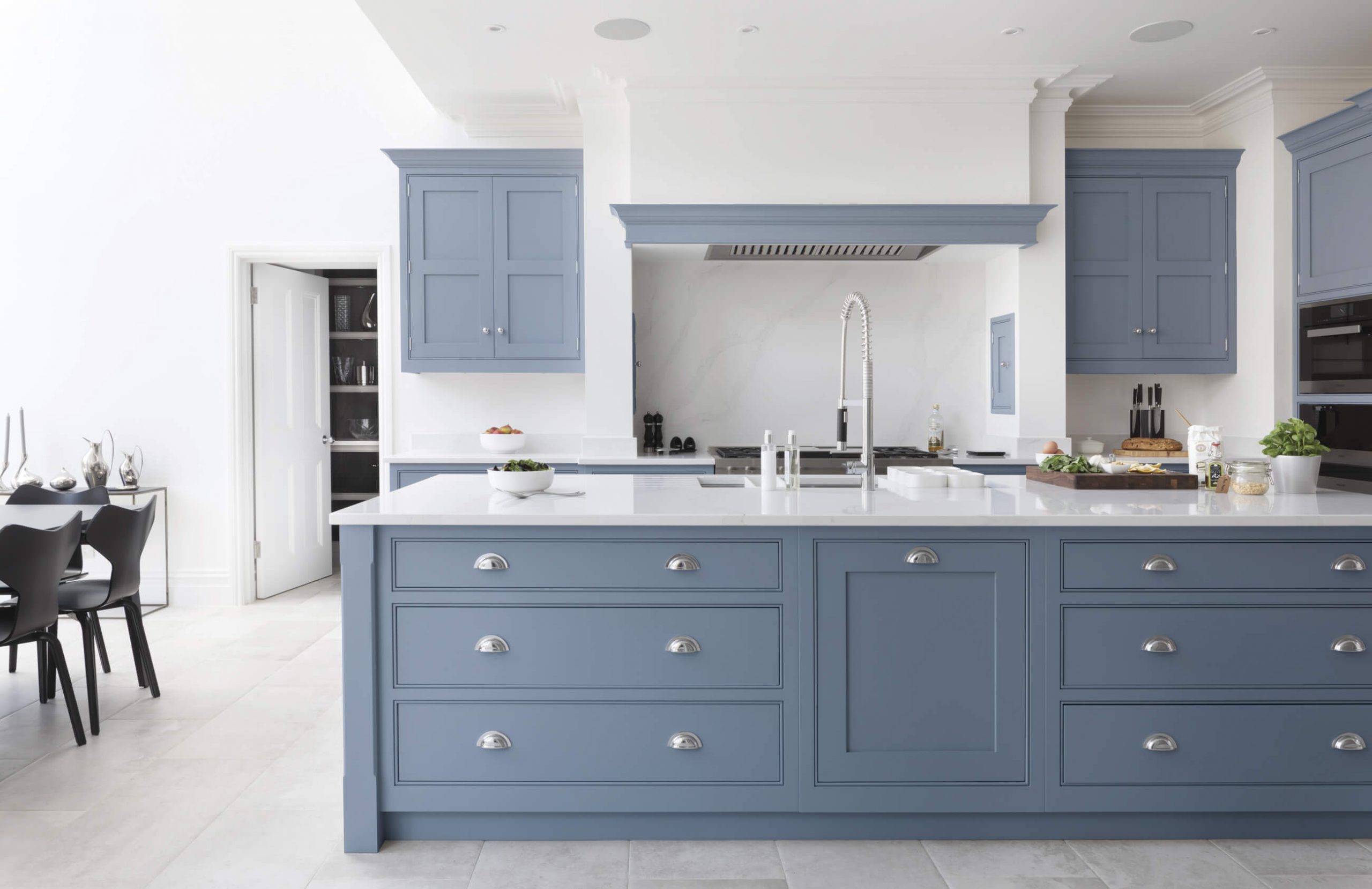

Pantone recently unveiled its Colour of the Year for 2022 and its playful, positive and inspiring notes feel like a breath of fresh air. That’s because Very Peri, a warming, bold lavender tone, is a brand-new shade that Pantone has invented from scratch. Described by Pantone as ‘a dynamic periwinkle blue hue with a vivifying violet-red undertone that blends the faithfulness and constancy of blue with the energy and excitement of red,’ it’s a colour promising to bring joy as the ‘happiest and warmest of all the blue hues’. But the question is: how can we corporate this trending hue into our kitchens? Read on to discover our top tips on how a blue kitchen design might be the perfect fit for your home.
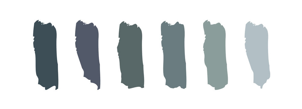
What do we mean when we talk about blue? Very Peri is just one notch on the unending spectrum of blues, from International Klein to Tiffany, Royal to Cobalt. Our evolving Tom Howley paint collection comprises six blues, ensuring our clients have a curated selection to choose from. Lithodora, Periwinkle, Iris, Azurite, Inky Sky and Opal span blues spiked with reds, rendered with indigos and foiled with hints of green. Tom Howley Periwinkle embodies the electric yet soothing hue of the eponymous perennial herb and evokes a sense of creativity, lending a contemporary edge to the kitchen.
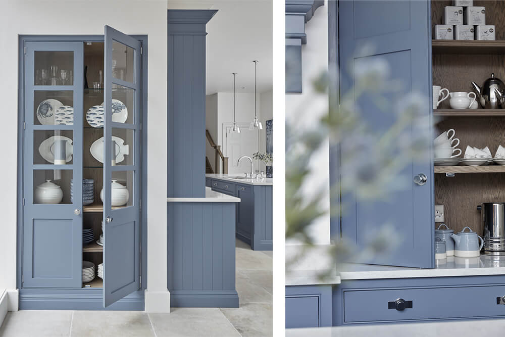
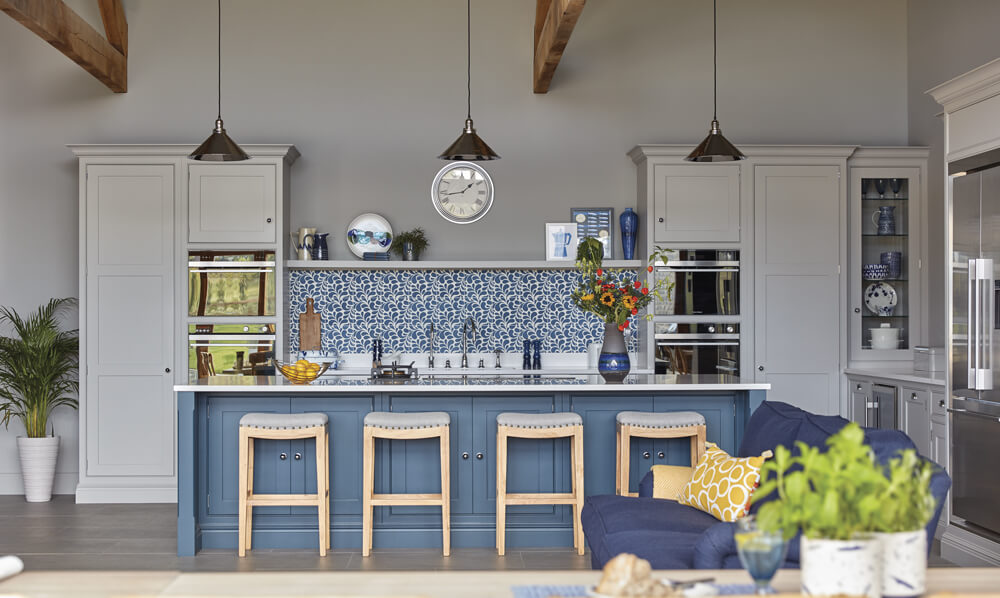
The blues in our Tom Howley colour palette pair sympathetically with the rest of our neutrals, meaning our clients can pare them back or accentuate their depths. Colour in the kitchen can be a bold step for some, so incorporating it slowly in the form of accent islands or pantries can be a good place to start.
There is so much to consider when it comes to bringing colour into your kitchen in sensitive and intelligent ways. Firstly, we blend our unique paint colours and then assess where they work best before committing a single brushstroke to your cabinetry. For example, we look at where natural light floods the room and how that will interact with the colours you choose. We also consider the style of furniture that you’ve chosen and discuss where features or statement pieces in statement colours will sit. Our holistic approach also takes us into neighbouring rooms in the home to assess which colours will breathe life and style into your kitchen.
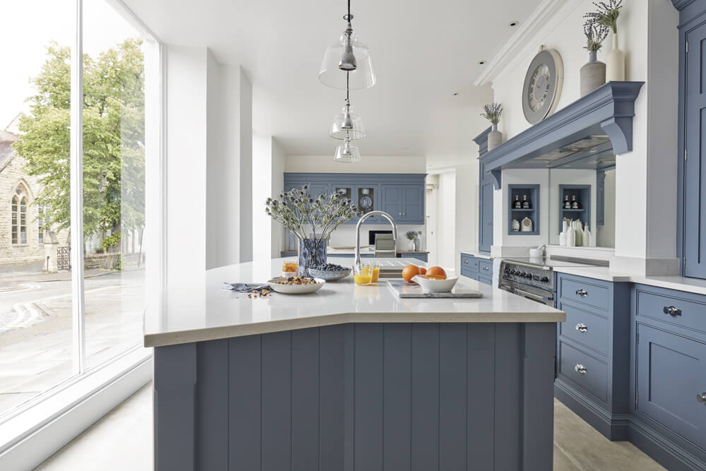
Blue tones are some of the most versatile and popular colours you can use in the home. However, it can sometimes be tricky to get right. Too much and a room can feel cold, too bright or distracting. To balance out your blue palette, you may want to add a secondary colour in a complementary or contrasting shade. Soft furnishings and kitchenware in warm oranges, mustards and neutrals work to complement and lift blue hues.
Blues work exceptionally well in the kitchen because they are largely associated with open spaces, freedom, imagination and inspiration, perfect for a busy, multifunctional space. Our Periwinkle paint colour works in harmony with almost any kitchen design, enhancing the subtle details of each collection. Its lightness allows cornicing and bevelled details to catch the light, highlighting the silhouettes of some of our more detailed ranges, while its depths bring an established presence to the kitchen.
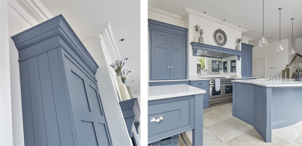
As Tom Howley, our Design Director, explains: “This warm blue is the perfect choice for creating a kitchen with a confident, stylish personality. A versatile shade with warm undertones it takes on a range of tones depending on the lighting. On a bright sunny day, it looks grey and fresh. However, on a rainy day or at twilight the lovely violet hues come through.”
With an endless palette of blue tones available for kitchen cabinets, walls, units, islands, or materials, there’s virtually no limit to what you can do when designing a blue kitchen.
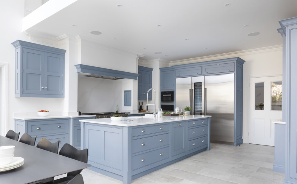
To help narrow things down, we’ve outlined some of our favourite ways to style a blue kitchen and create a unique and beautiful space for the family to enjoy.
Brass hardware:
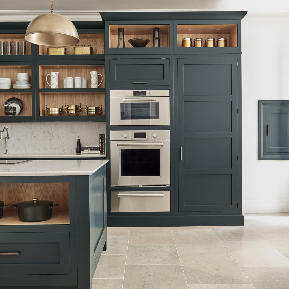
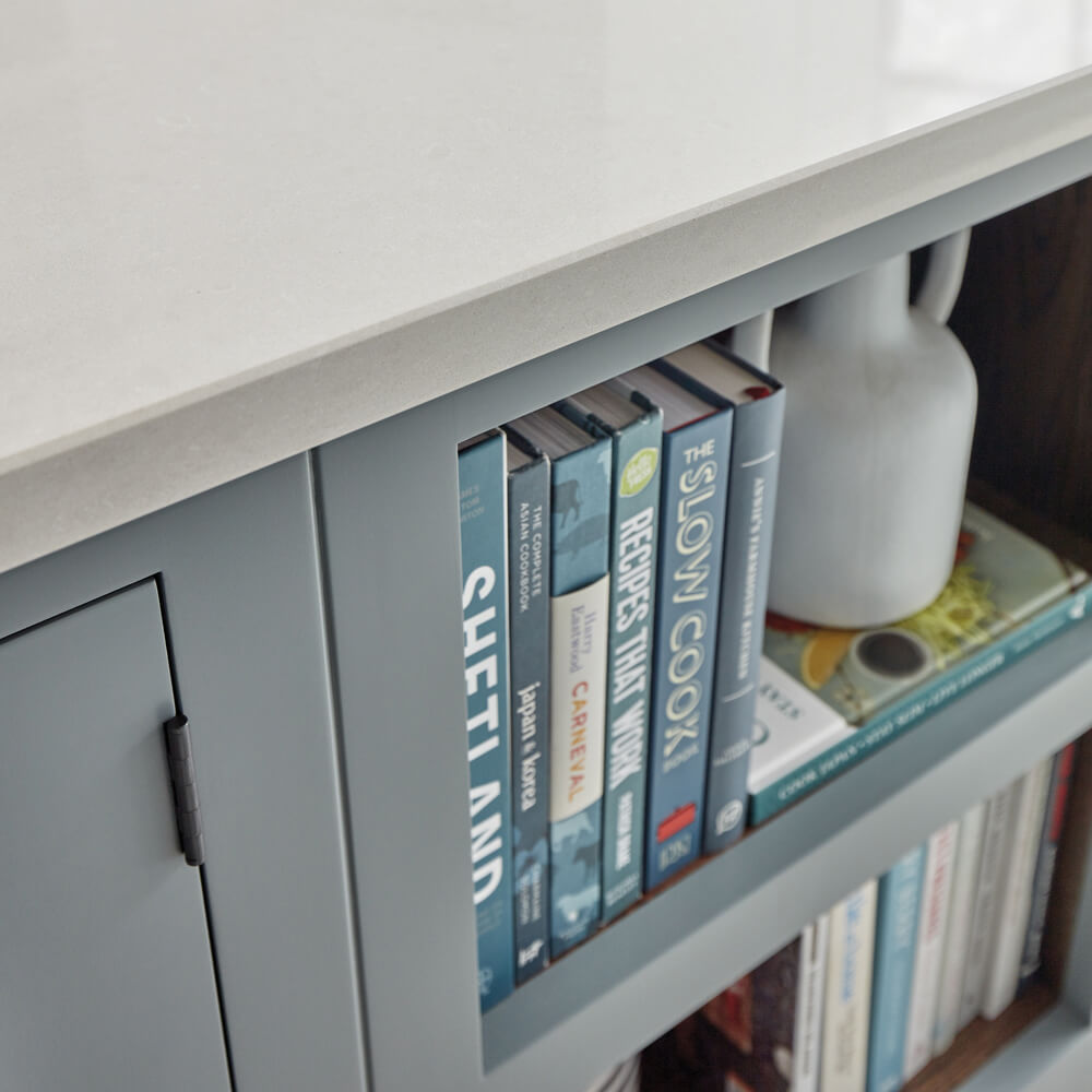
There’s something incredibly charming about blue kitchen cabinets accented with brass hardware. The warmth in the brass is the perfect contrast to the cool blue. This pairing is also very versatile with options to channel a contemporary sense of cool, a more rustic, farmhouse feel or a sleek, urban flourish.
Complement a blue kitchen design with marble countertops:
The pairing of marble countertops and blue kitchen cabinets has an eye-catching effect. The blue in the cabinetry helps to bring out the grey marble veining, highlighting the natural stone’s intrinsic beauty.
Even if you’re not brave enough to go for a full kitchen in Periwinkle or a similar blue colour, you can still introduce it in other ways. Using a two-toned palette enables you to add a bright shade without overwhelming the space. A great way to add the two-toned look is to combine your favourite neutral such as our warm grey ‘Tansy’ or off white ‘Orchid’ on cabinetry with a contrasting island colour such as Azurite or Lithadora.
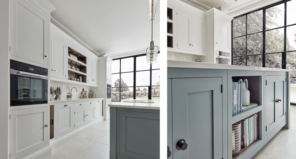
For the more daring amongst us, there’s no need to fear going bold with a single hue in your kitchen. Moving away from multiple shades and focusing on one key colour will create a stylish impact, working to amplify the furniture design. For a truly bold and unexpected look, why not paint both your walls and your cabinetry in the same colour? This can elevate your kitchen to new, contemporary heights and actually make the room feel more spacious. Looking for inspiration on how a blue kitchen design would work in your home? Visit one of our Tom Howley showrooms to speak to one of our expert Designers, explore a range of bespoke paint colours and pair them with your perfect Tom Howley kitchen design.